WORK
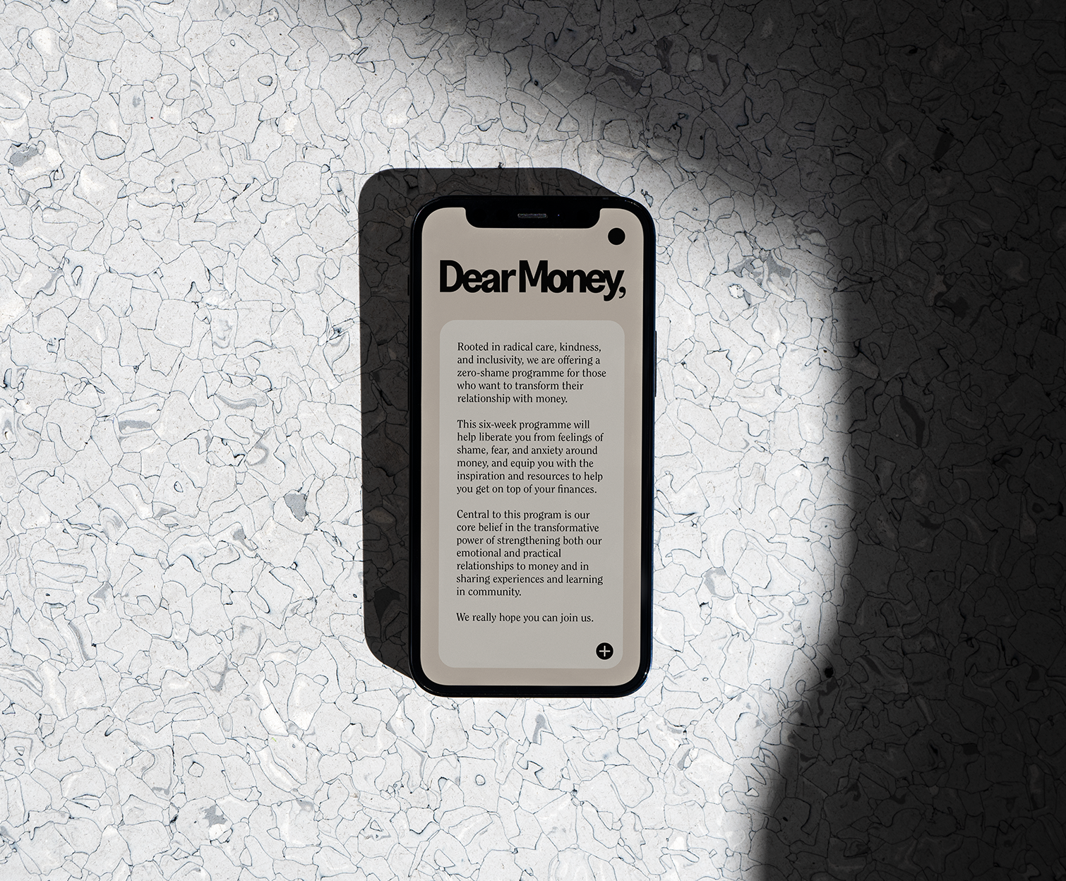
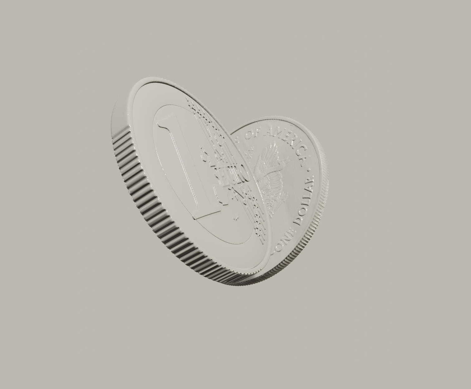
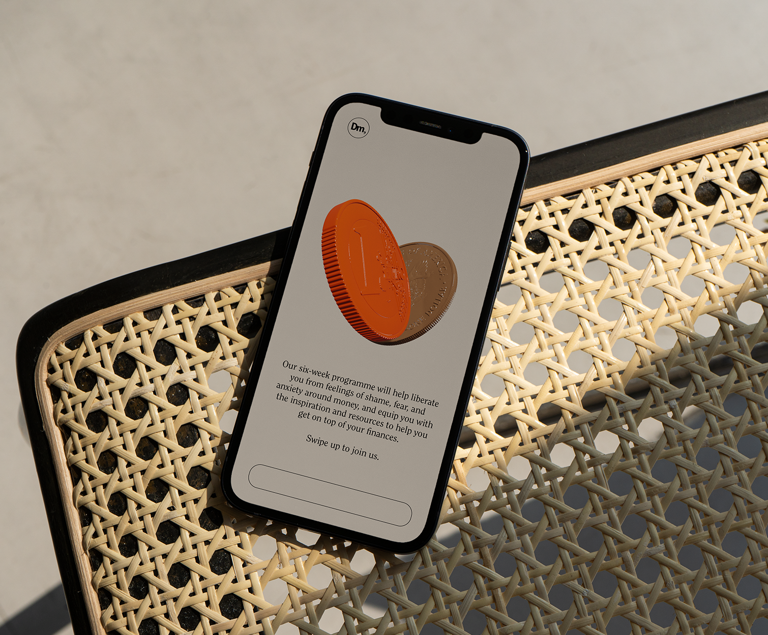
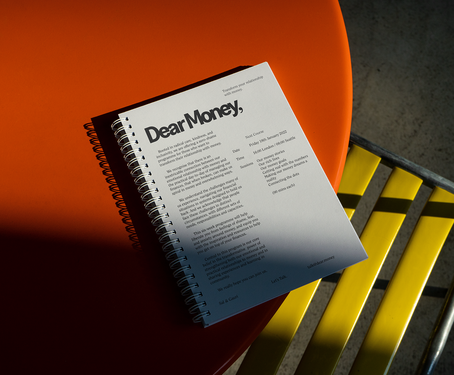
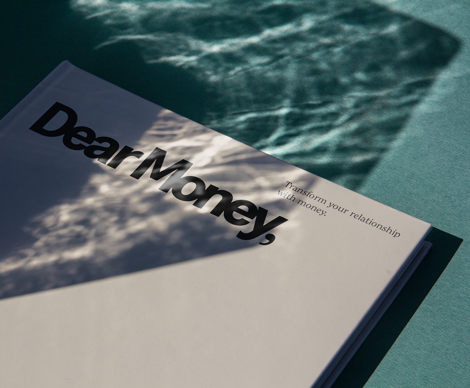
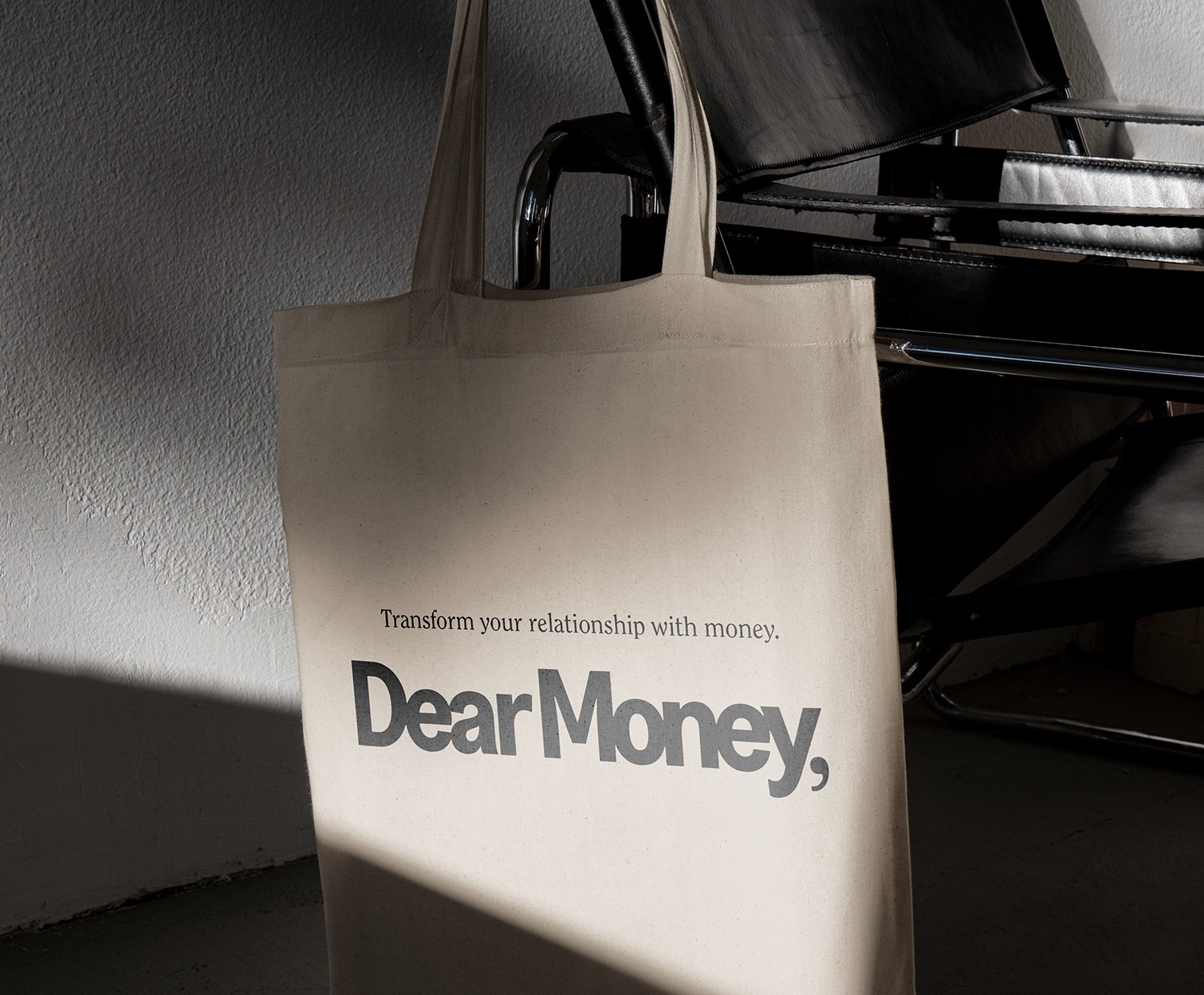
A NAME AND VISUAL IDENTITY FOR DEAR MONEY
Rooted in radical care, kindness, and inclusivity Dear Money is a zero-shame programme for those who want to transform their relationship with money.
To bring the idea to life I worked with the founders, Sal and Gauri, to develop a name that would capture their emphasis on understanding our own personal relationship with money. Building from the name we created a visual identity that reflected the warmth, care and heart that embodies their entire approach.
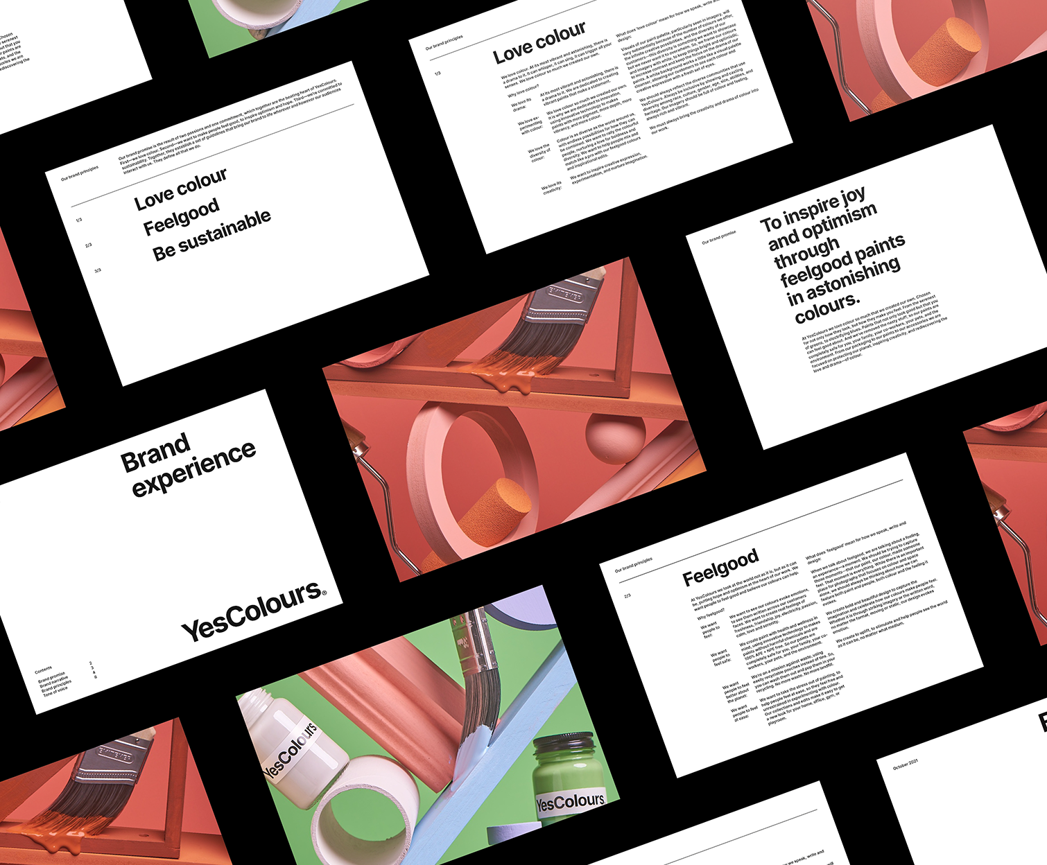
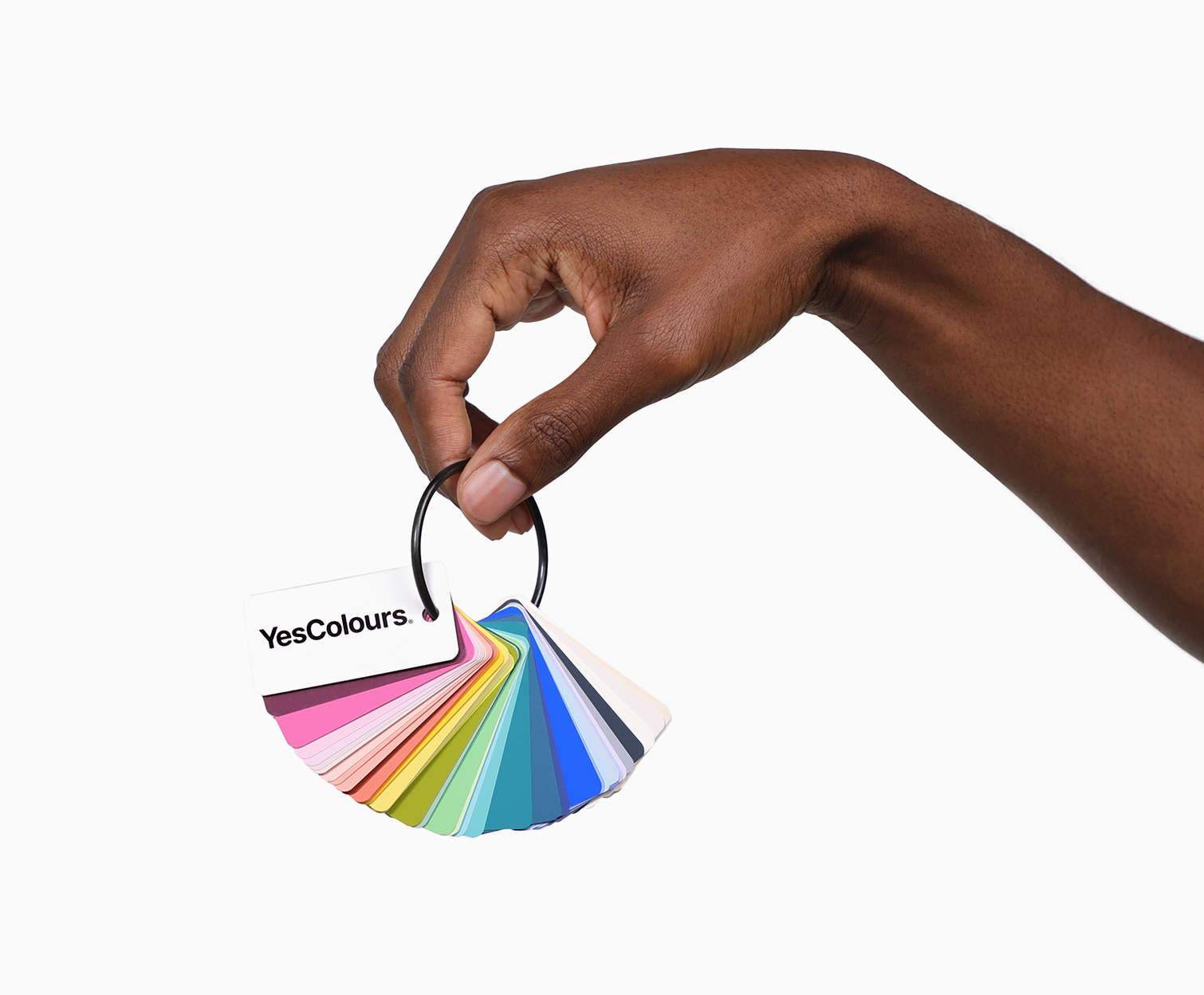
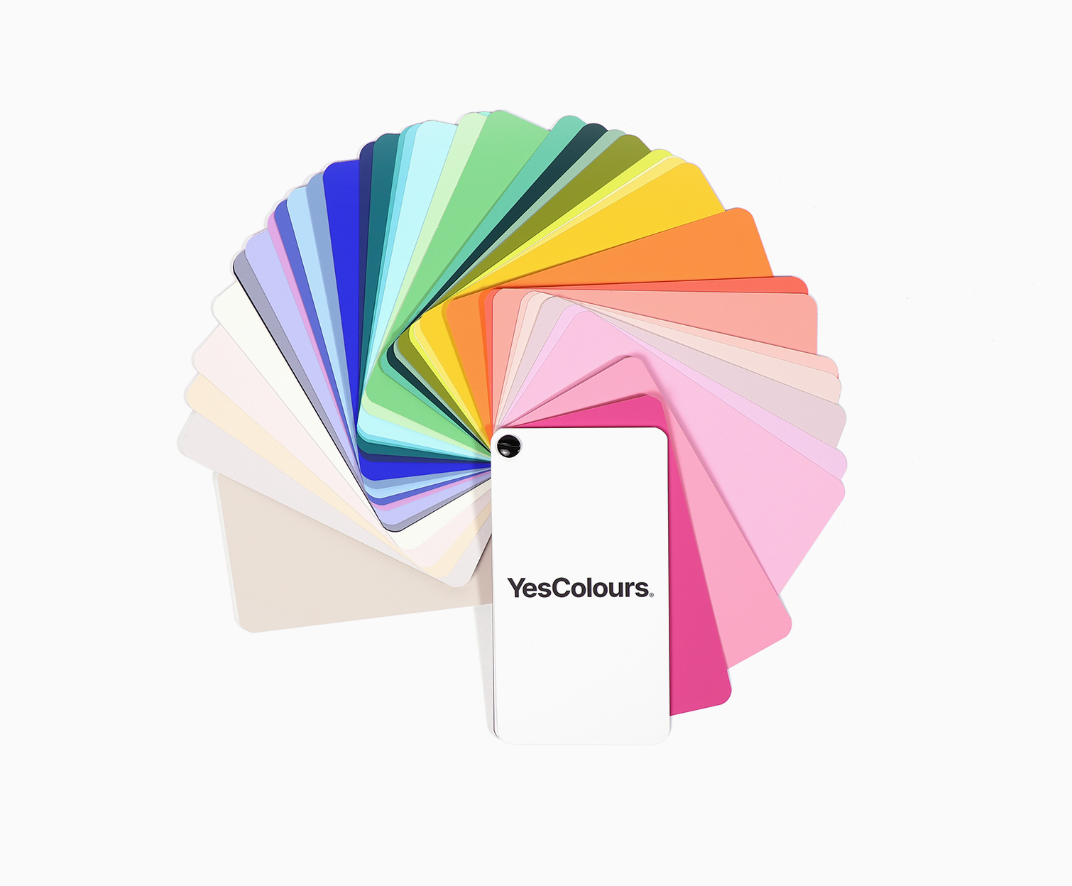
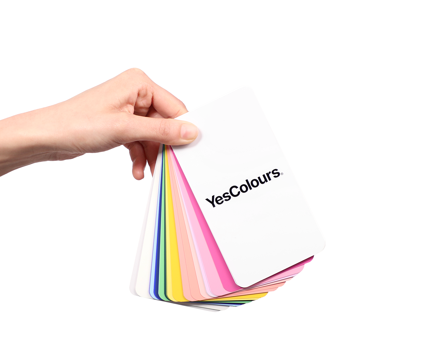
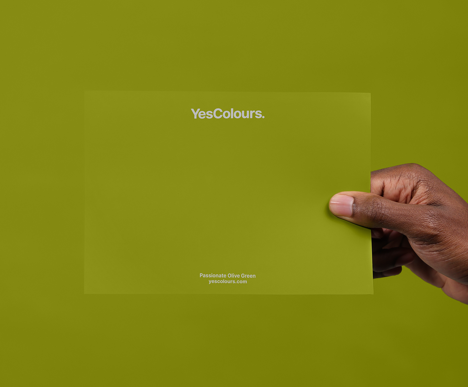
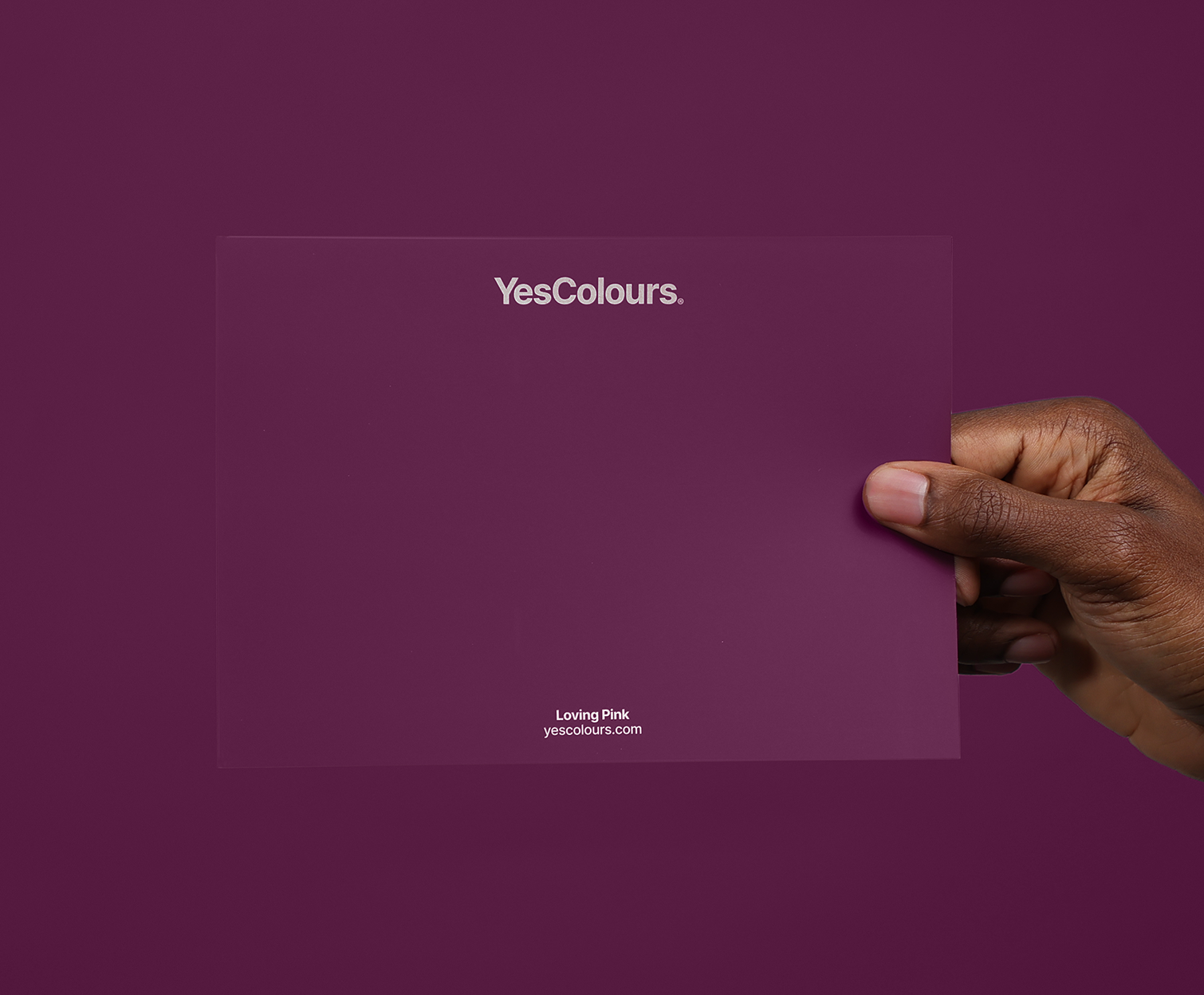
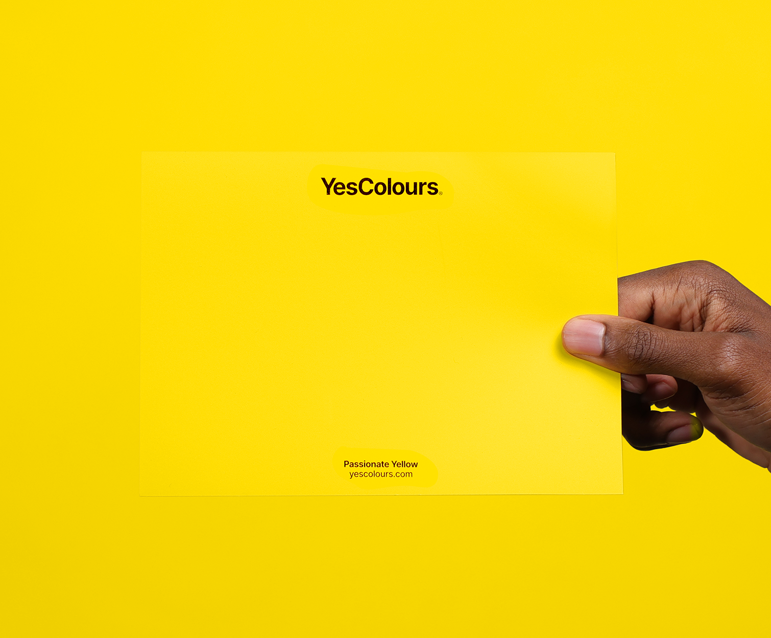
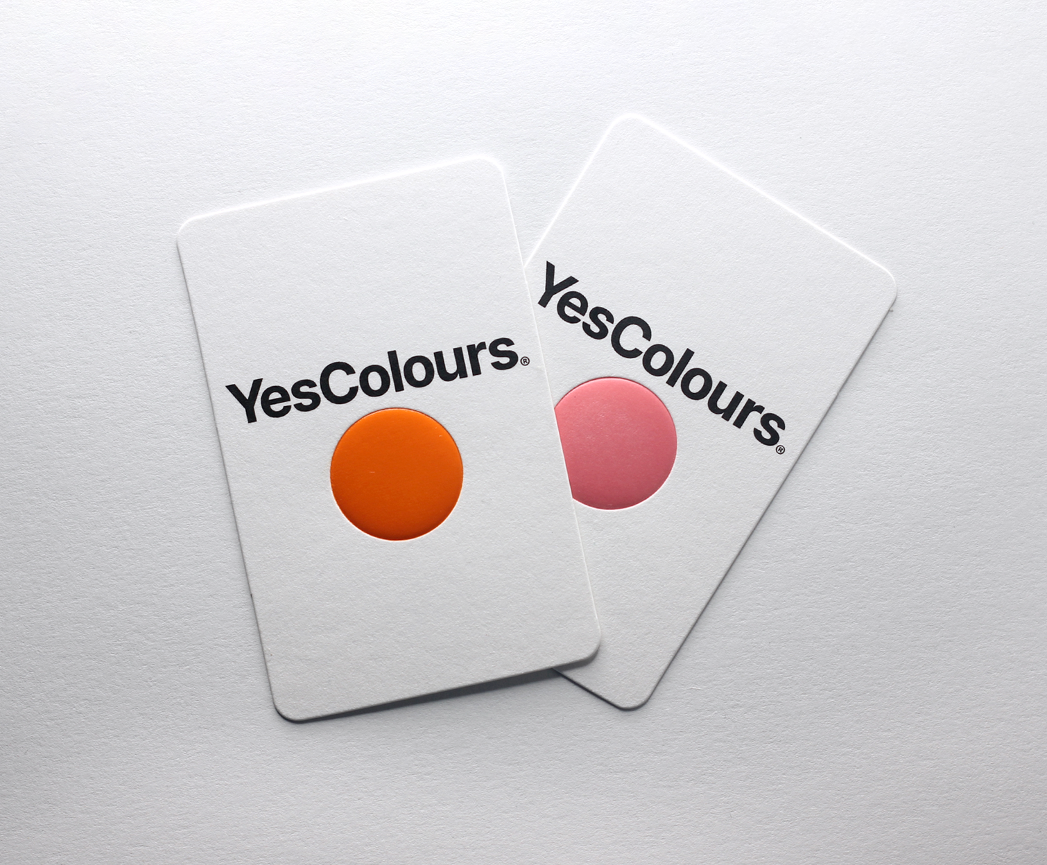
A BRAND STRATEGY FOR YESCOLOURS
To help launch the new sustainable paint brand I worked with the founder to create a brand strategy that captures the YesColours experience, one that focuses on their two passions as a company—to love colour and feel good.
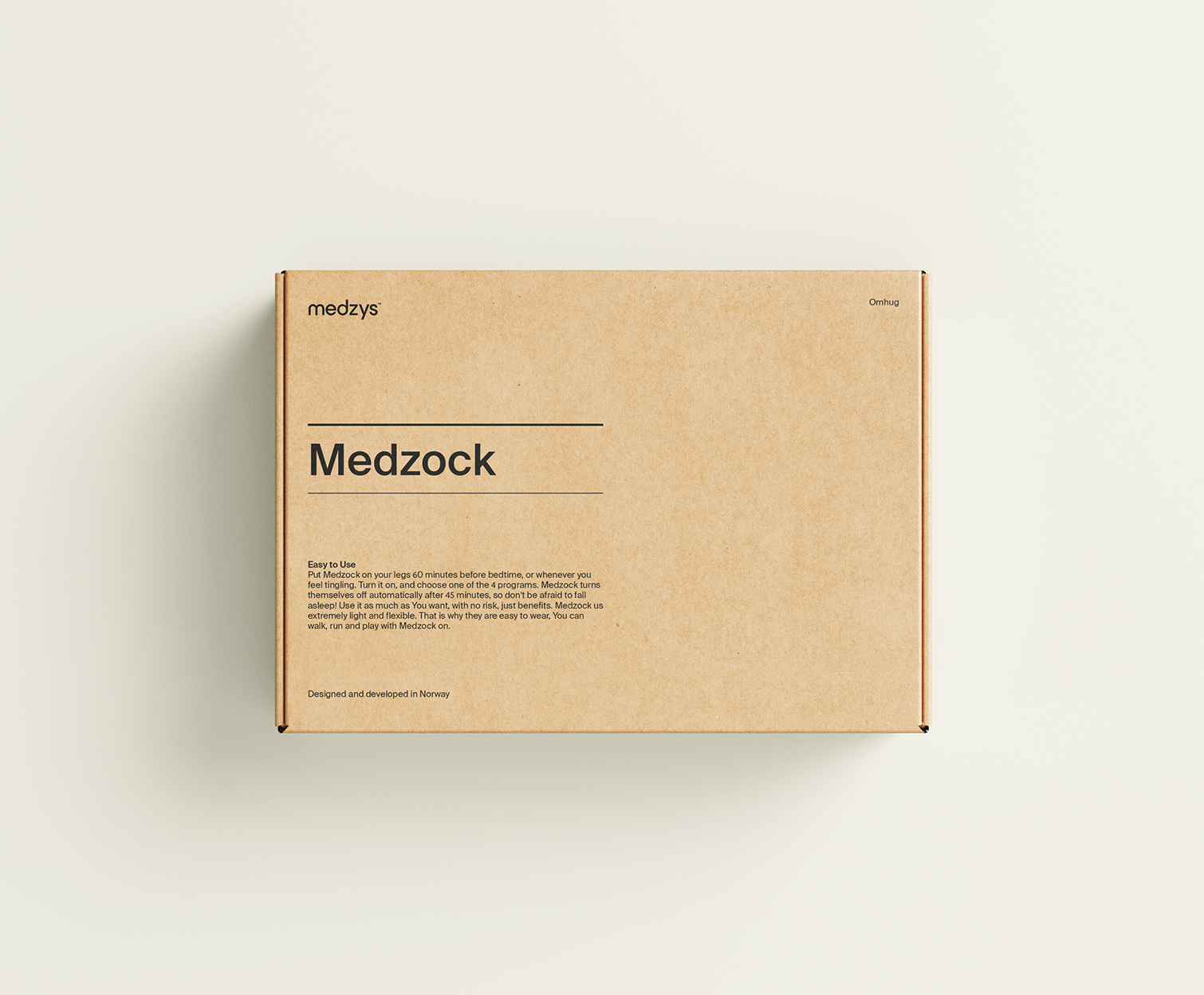
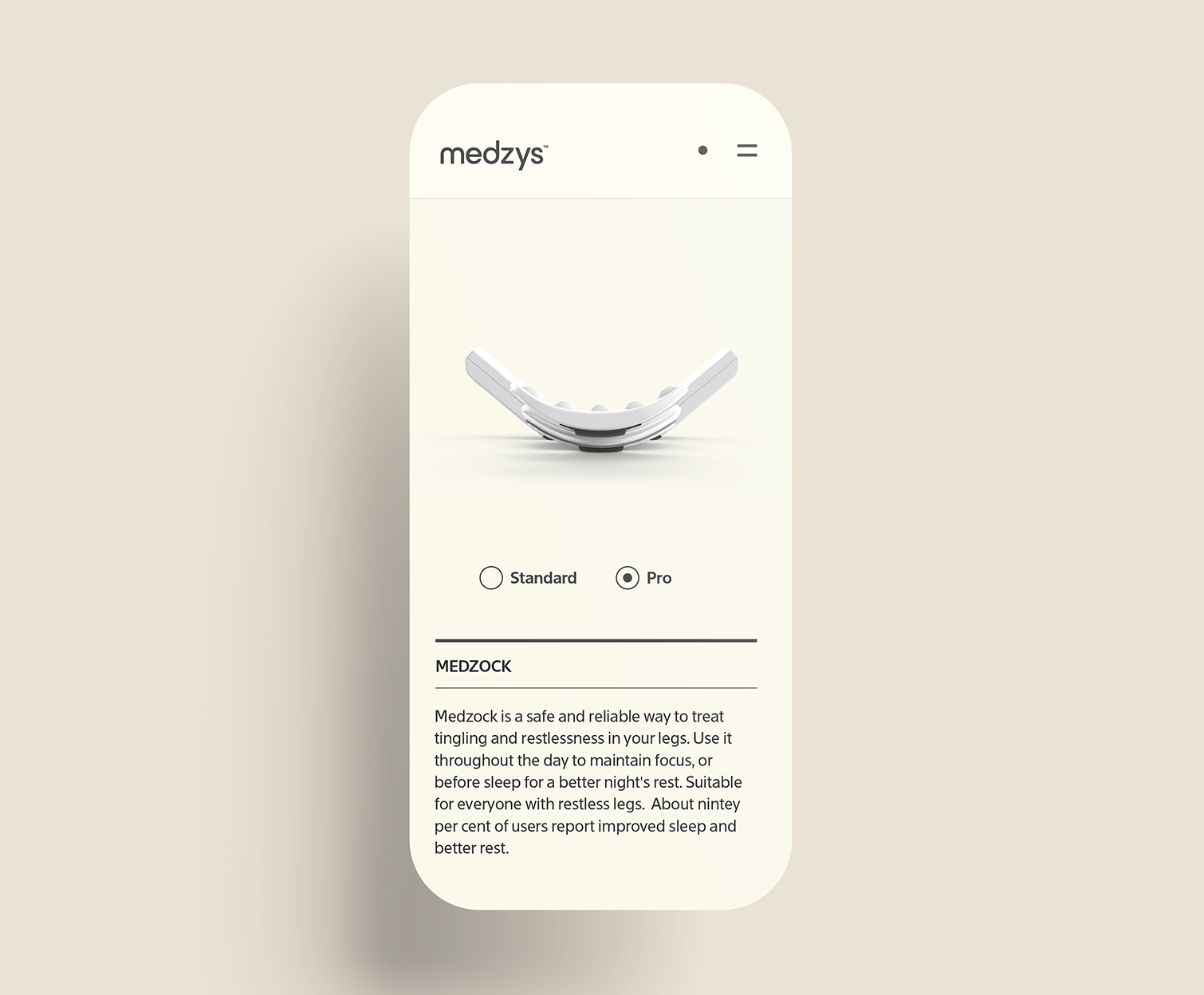
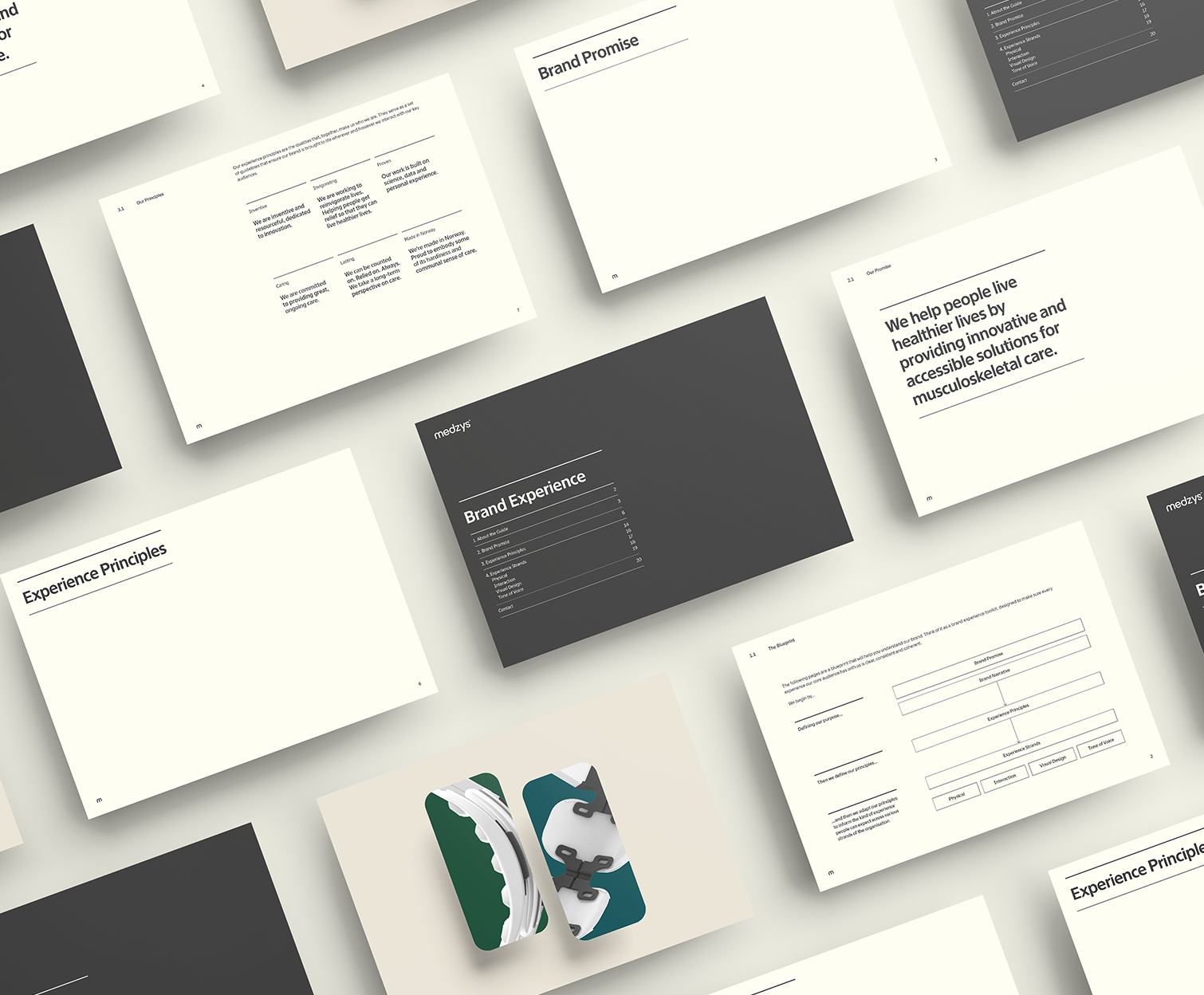
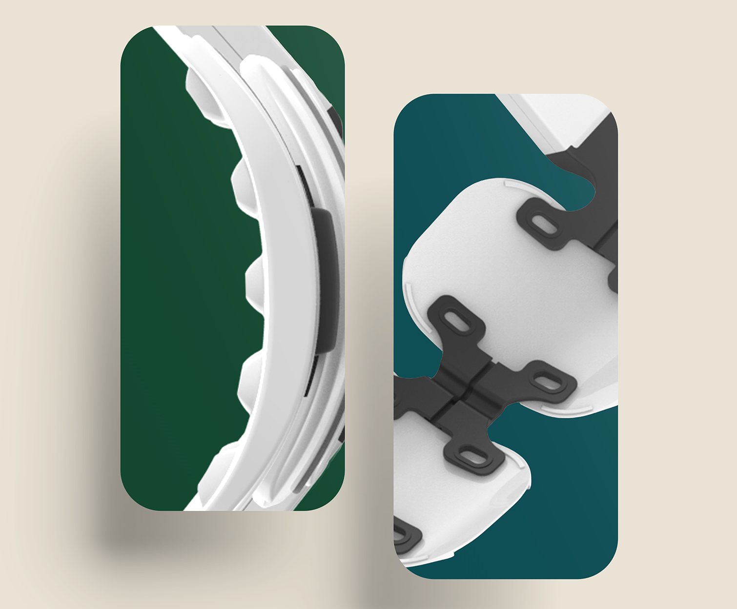
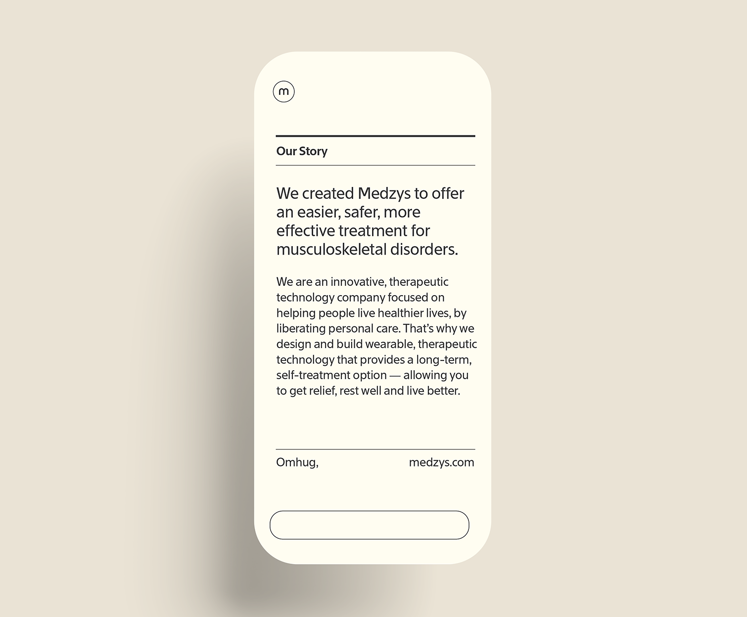
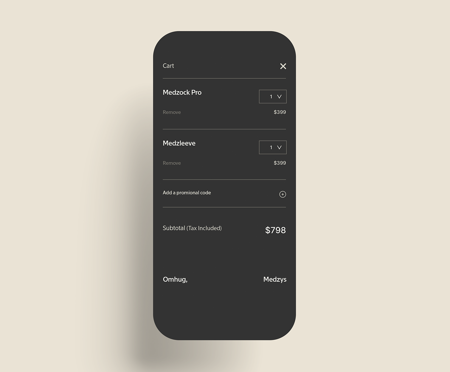
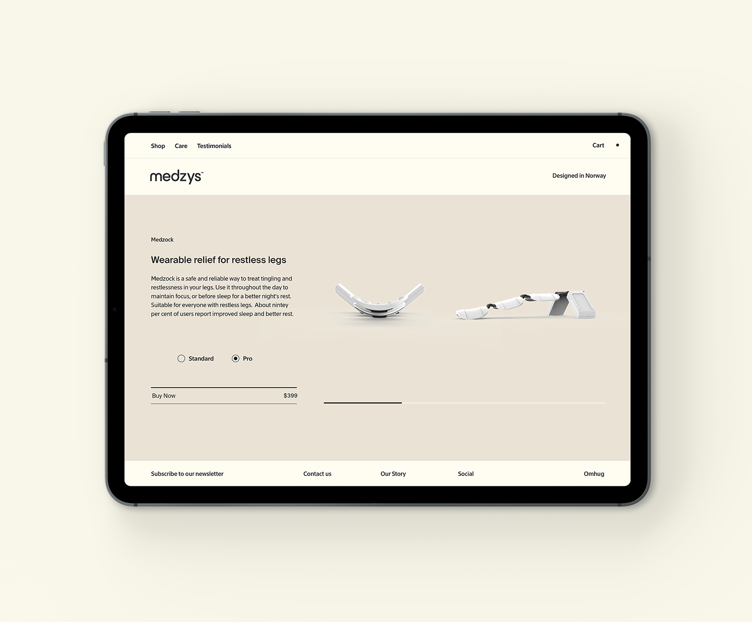
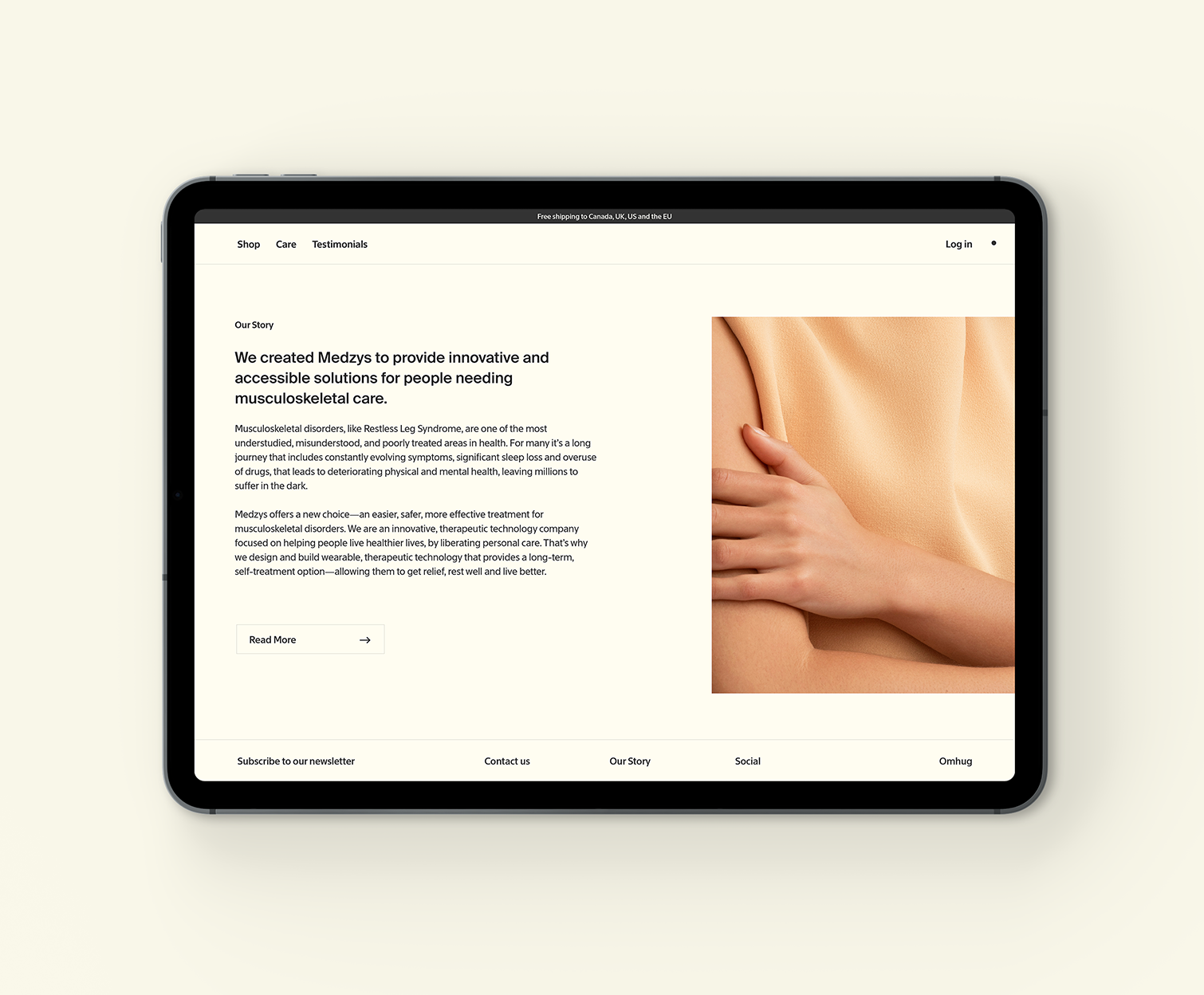
A BRAND STRATEGY AND VISUAL IDENTITY FOR MEDZYS
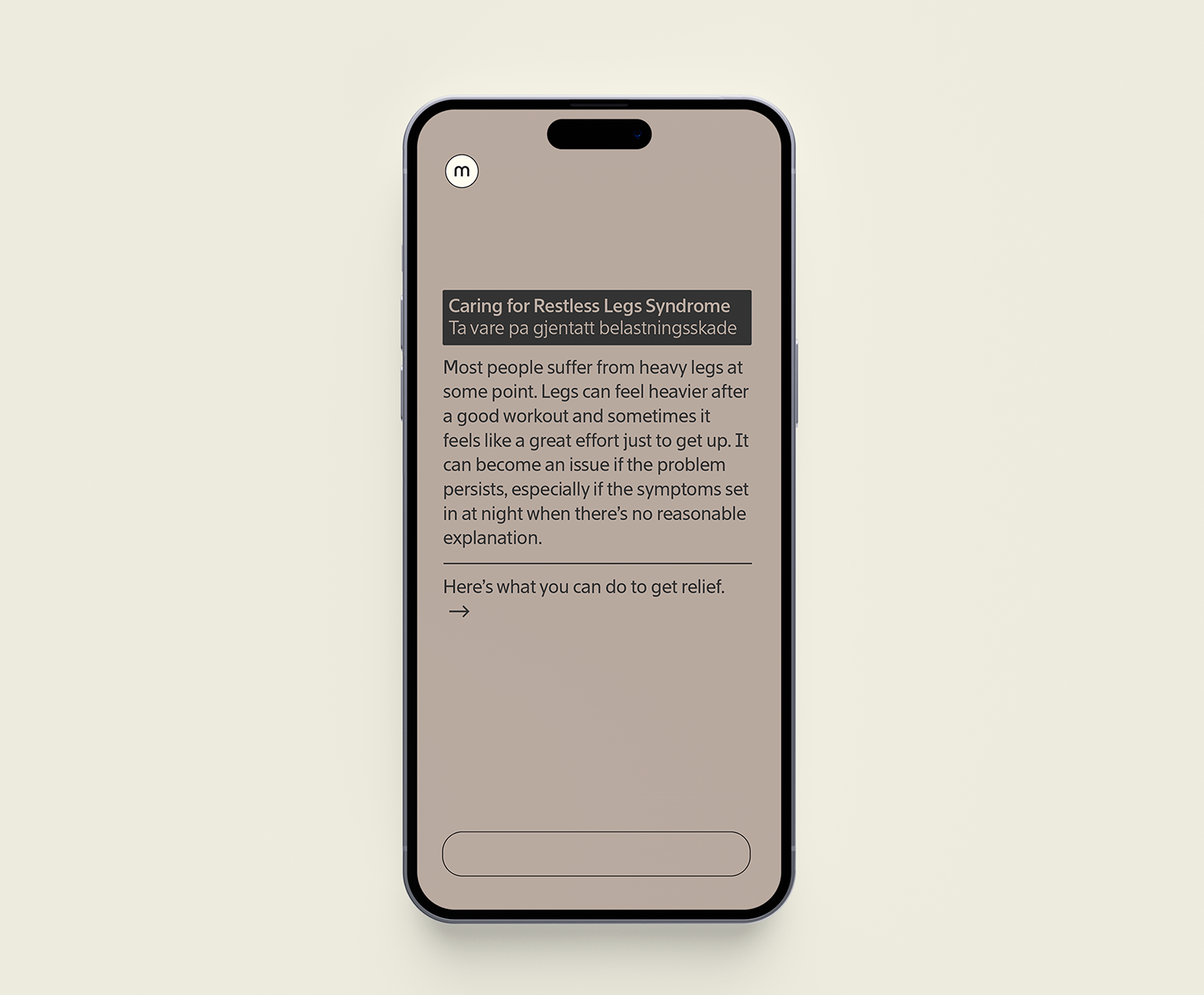
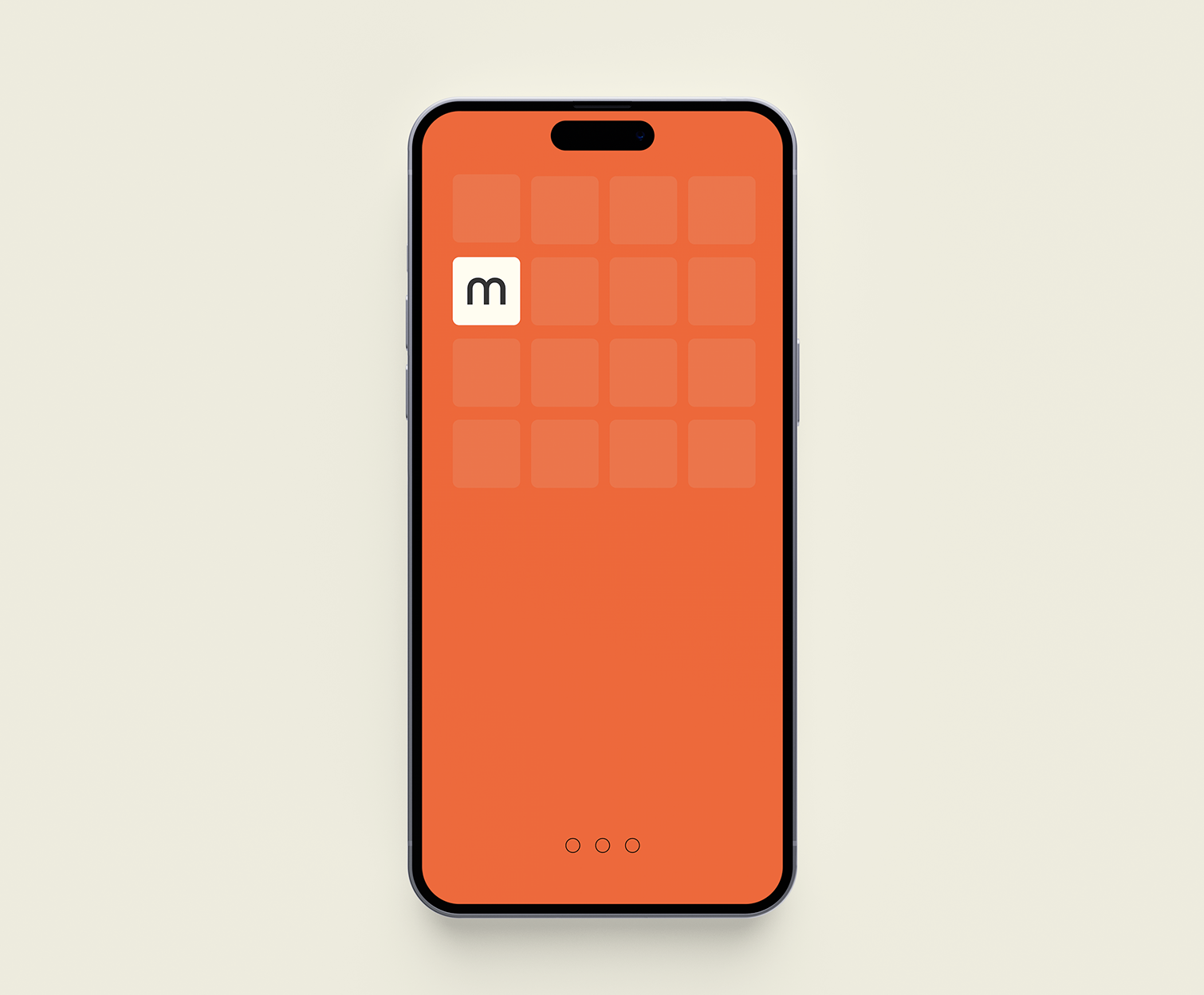
Medzys is an innovative, therapeutic technology company who design and build wearable, self-treatment devices that provides people living with musculoskeletal disorders with lasting care—allowing them to get relief, rest well and live better.
Working with Medzys founder John Hornes, I developed a visual identity that the Medzys brand principles to life by creating designs feel comfortable and homely, and put people at ease. That avoid the subdued, conservative, cold look of healthcare marketing. That balance quiet and calm with vibrancy. And that embody the company’s Norwegian heritage, with designs that marry modern and heritage and colours that feel natural and refreshing.
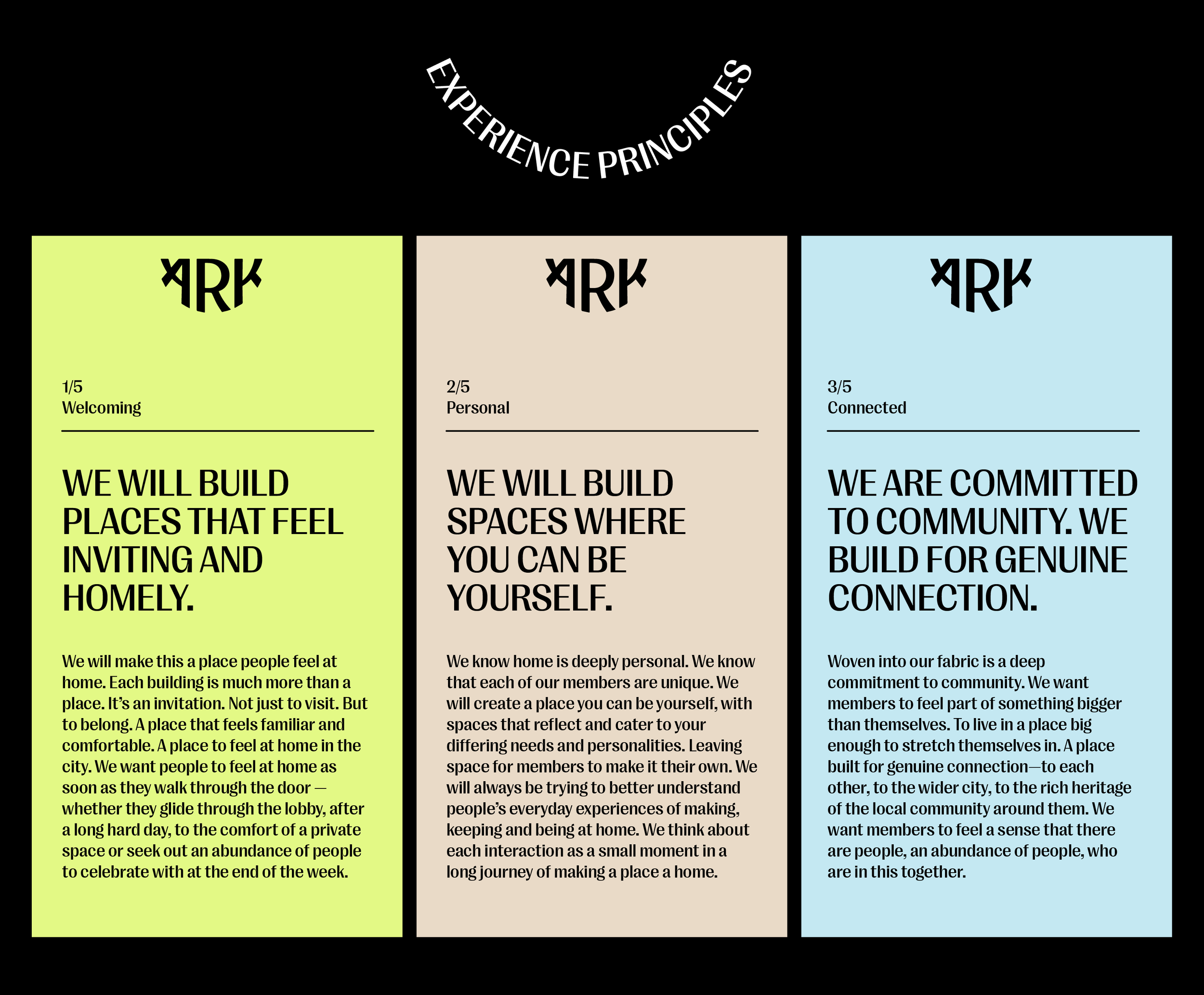
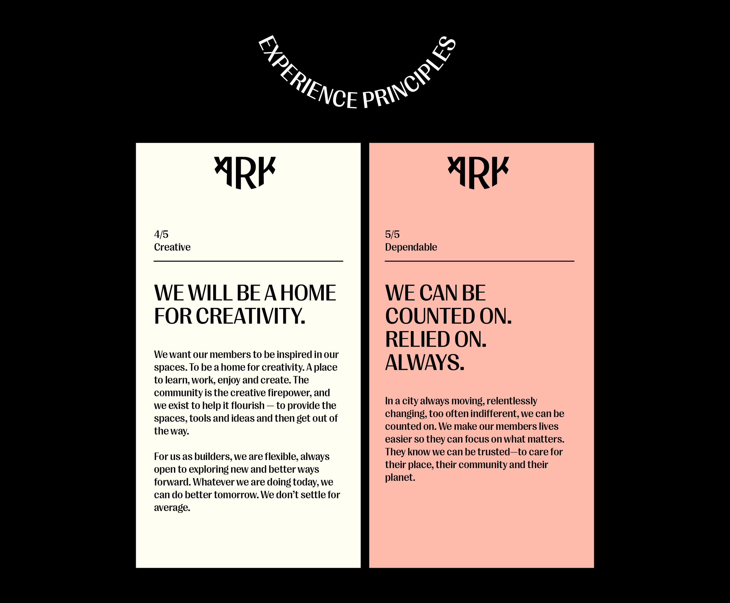
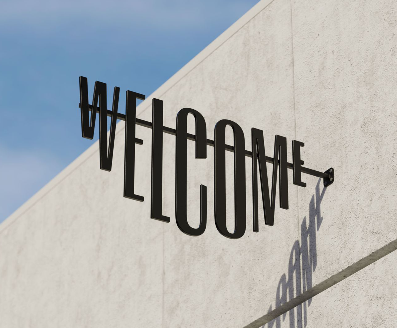
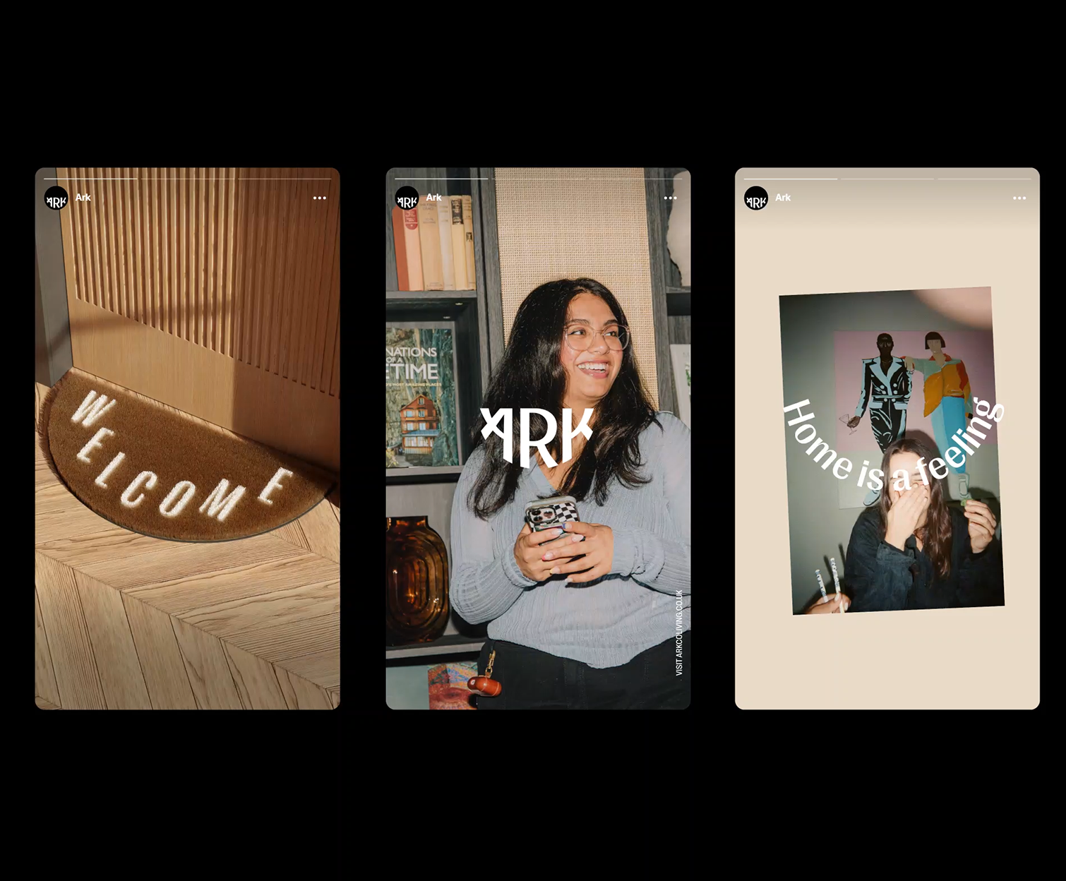
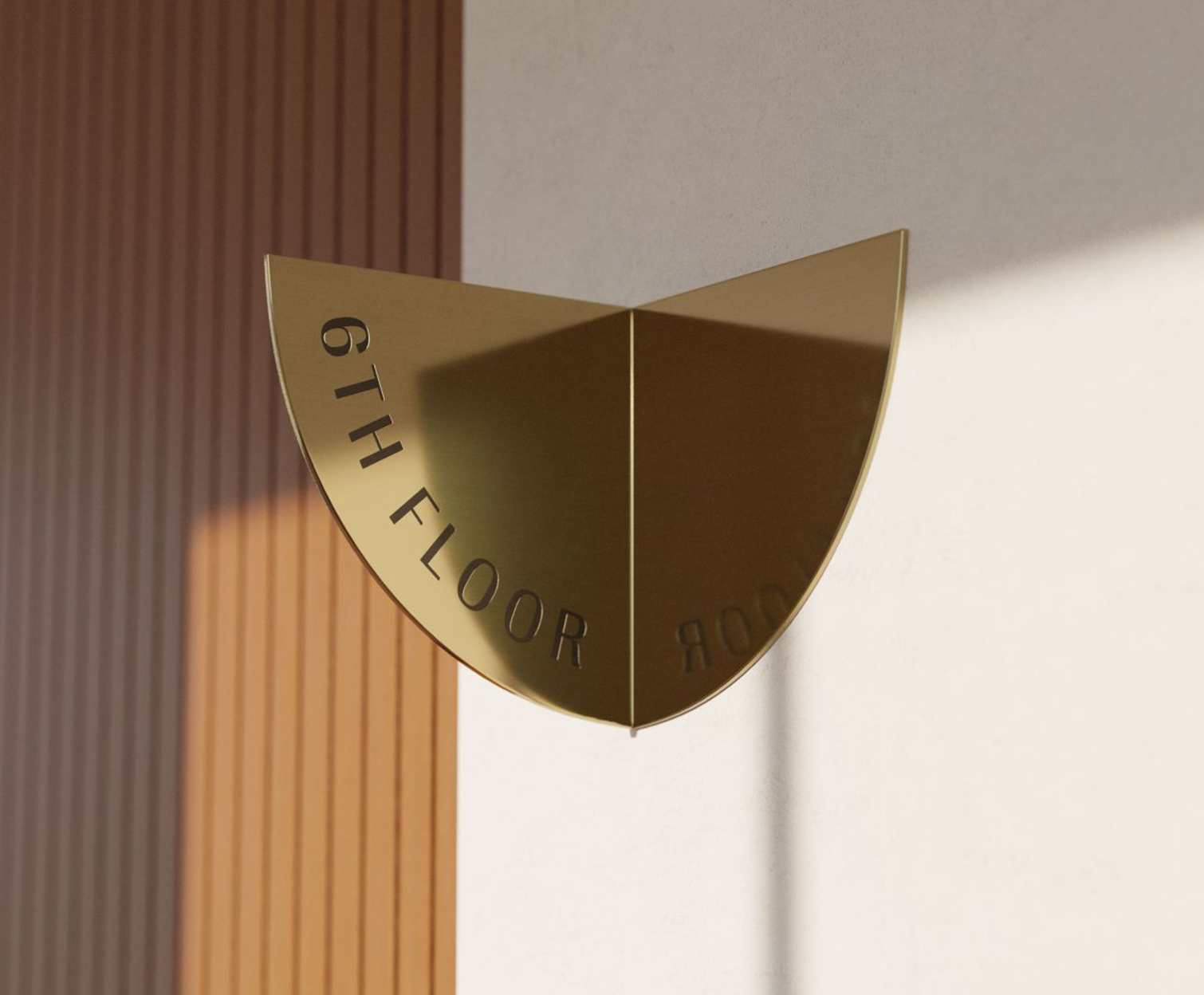
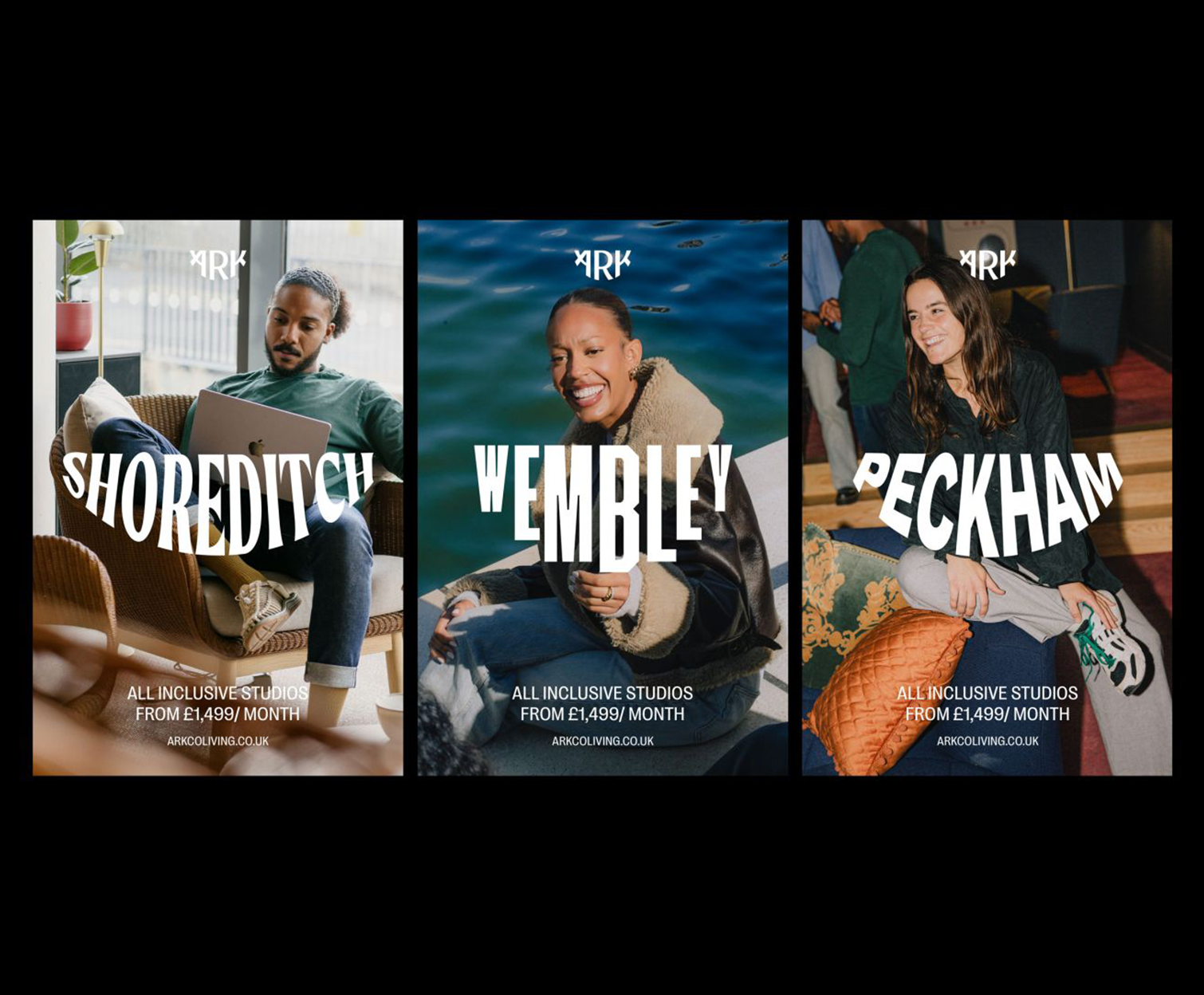
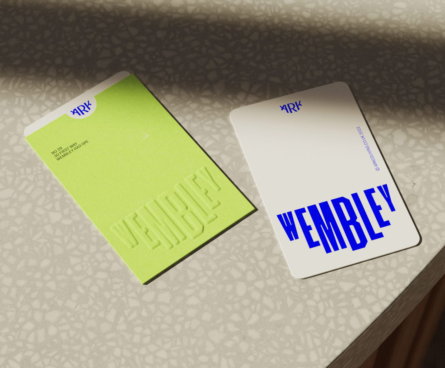
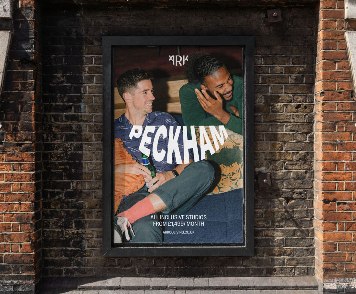
BRAND PURPOSE AND PRINCIPLES FOR ARK
Led by the talented team at OMSE, I worked on the early stages of this project, helping the team define a clear vision and a set of principles that would serve as a blueprint for creating a consistent, coherent brand experience for ARK.
OMSE used these principles to inform and guide every strand of the brand development, including the stunning visual identity they created, which sets ARK apart from other co-living spaces, striking a balance between being instantly recognisable while also feeling deeply rooted in the rich heritage of the communities they’re a part of.
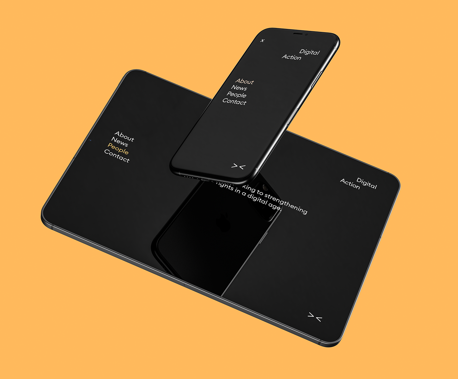
A BRAND STRATEGY AND VISUAL IDENTITY FOR DIGITAL ACTION
I worked closely with Digital Action’s Chief Executive Liz Carolan to develop a brand strategy for this new organisation. Starting with just Liz’s desire to help strengthen democratic rights in our digital age, we built a new organisation. From the name, to the narrative, from the service strategy to the visual identity, from business cards to stationery, I supported them in turning an idea into a brand. The concept for the logo comes from the idea that much of the political and corporate world has turned a blind eye to the digital threats to our democracies. It is time we open our eyes. The concept plays on three things: it uses the arrow characters used in code, which also look like a D and an A, and which together look like a pair of eyes.
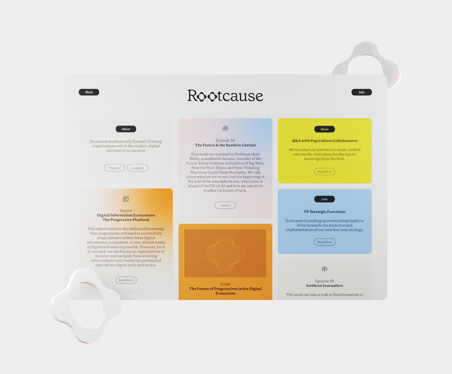
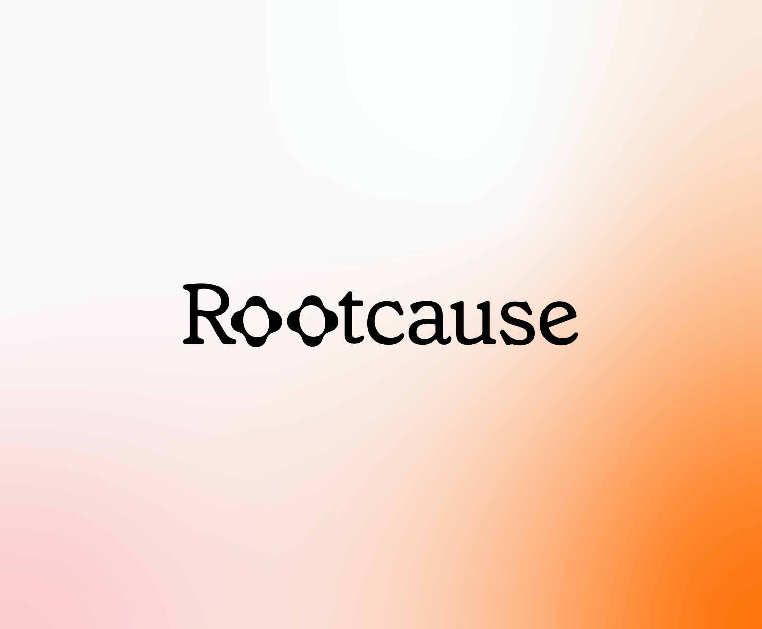
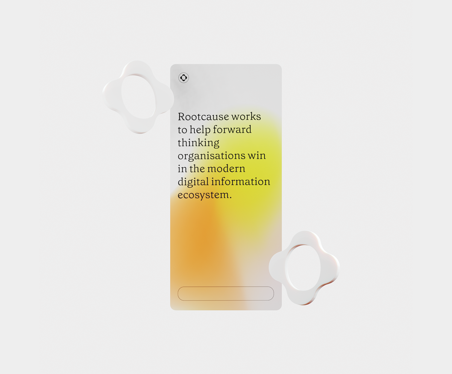
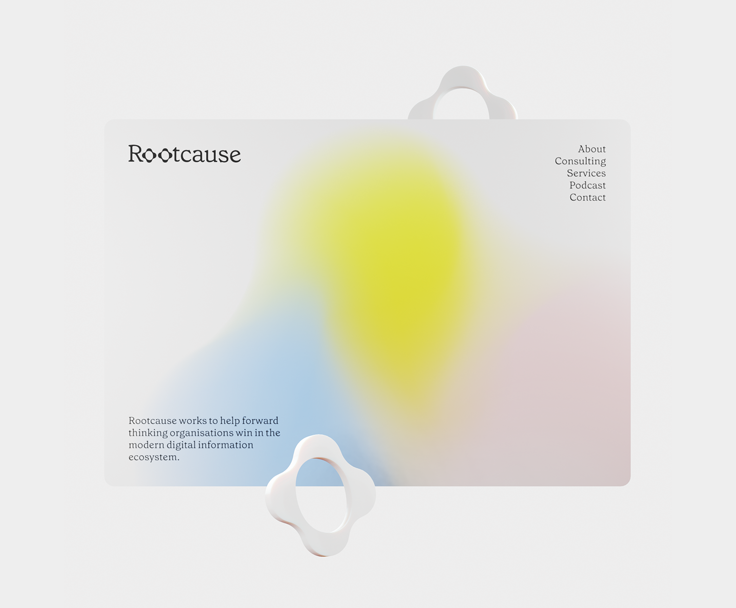
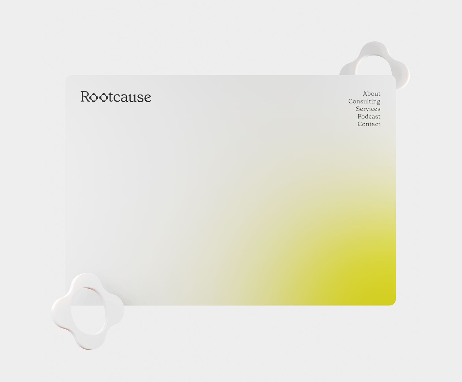
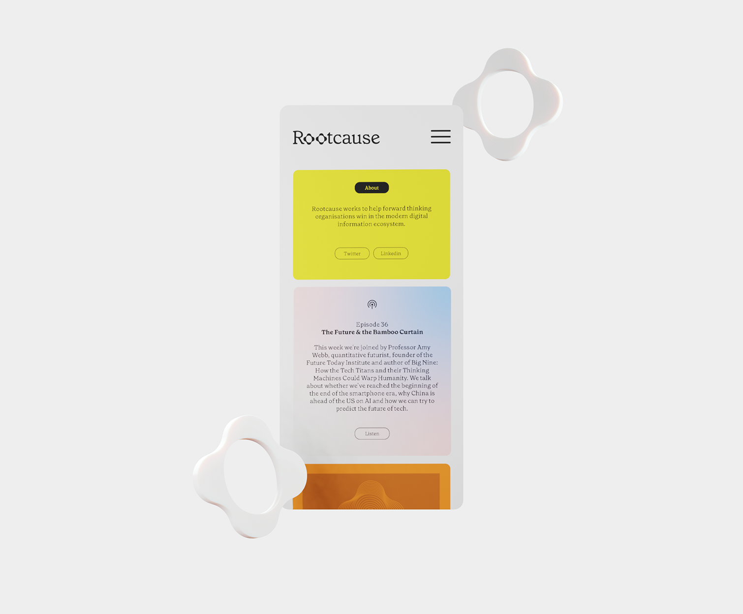
A BRAND STRATEGY AND VISUAL IDENTITY FOR ROOTCAUSE
Combining artificial intelligence, data and experience, Rootcause is new not-for-profit consultancy helping forward thinking organisations win in digital info ecosystems. To create the visual identity I worked with its founder, Jonathan Tanner, to bring his passion—for going deep, ‘rooting around’ and getting to the bottom of things—to life. The wordmark draws on the root system in nature—that highly complex, not widely understood, network (much like networks Rootcause analyses and navigates in social media). Using the natural curves of Colophon Foundry’s Grenette, the two O’s of the word mark are tweaked to appear like a bird’s eye view of a tree trunk, its roots just beginning to stretch out before diving below ground. A single root-O also serves as the main icon.
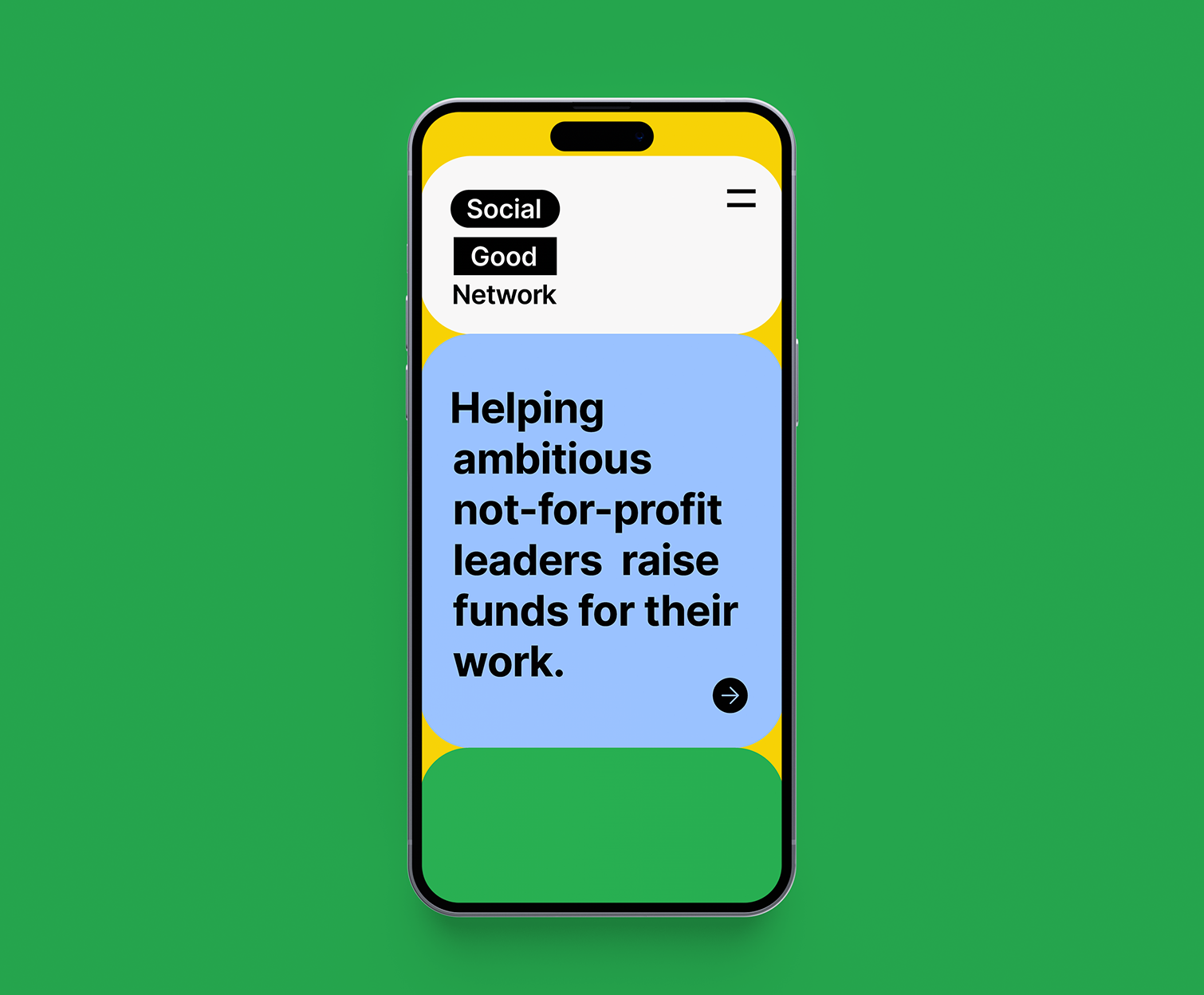
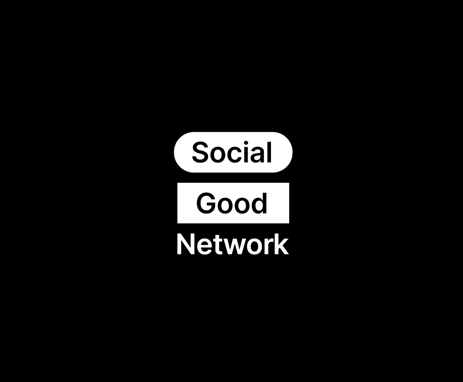
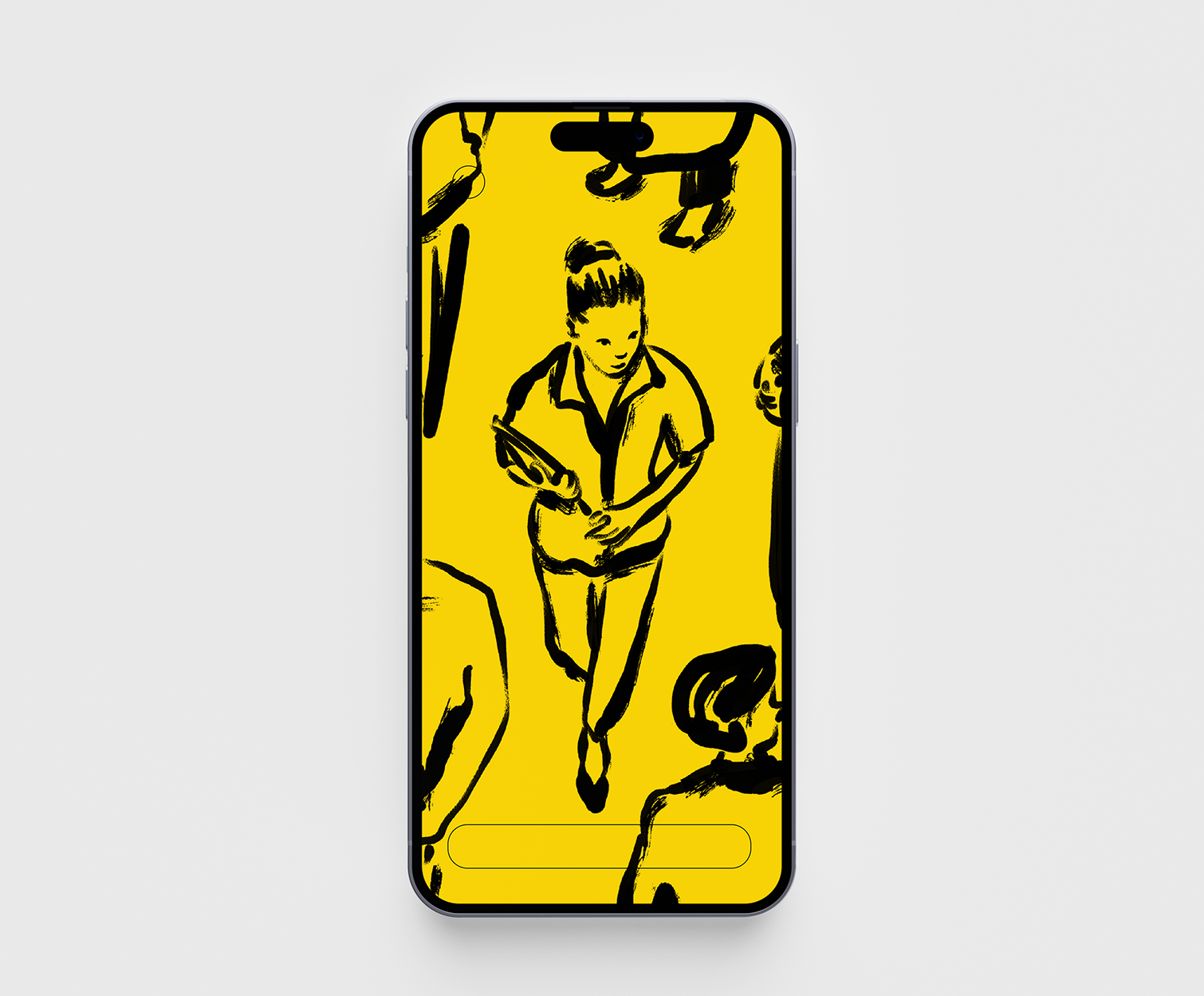
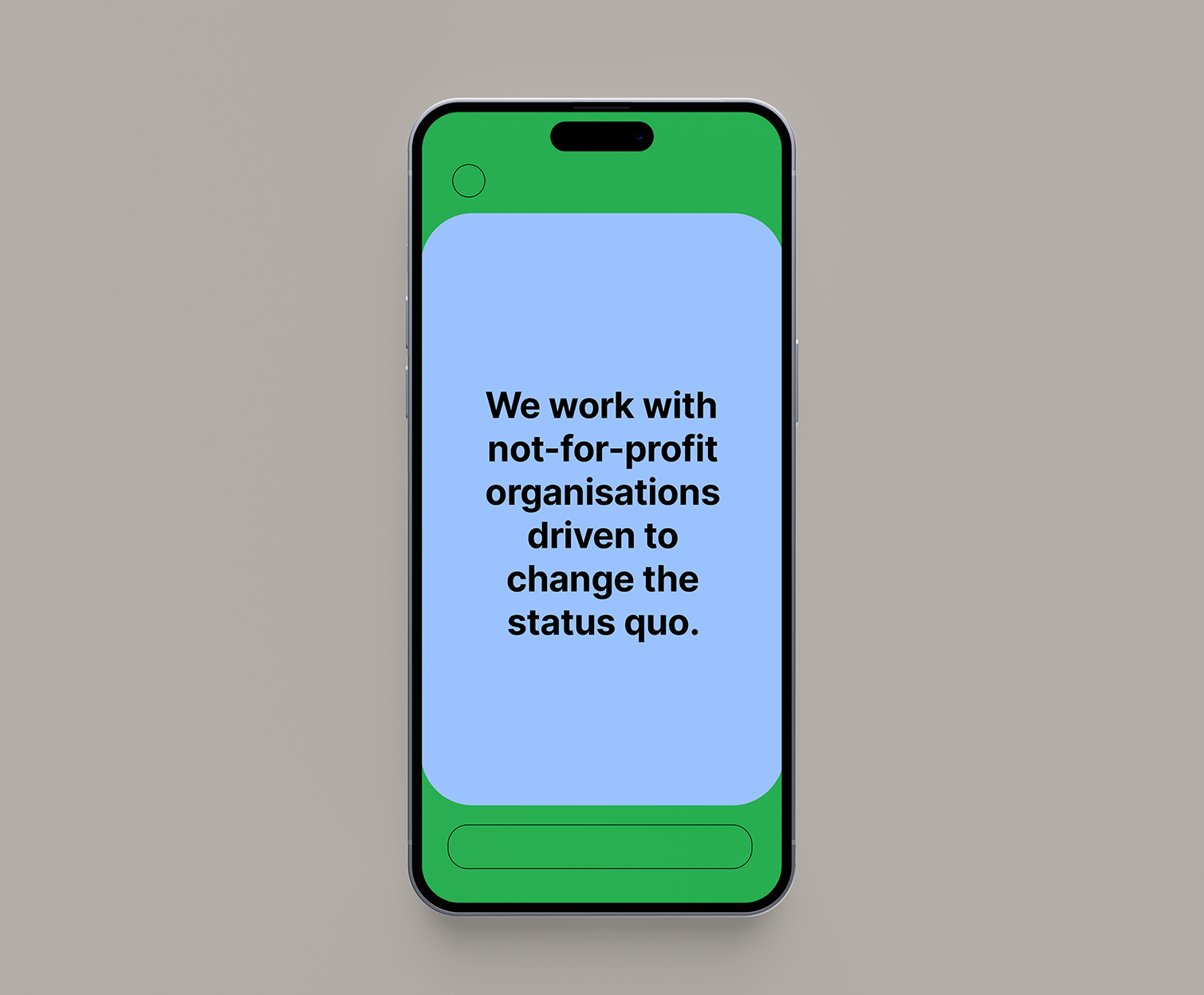
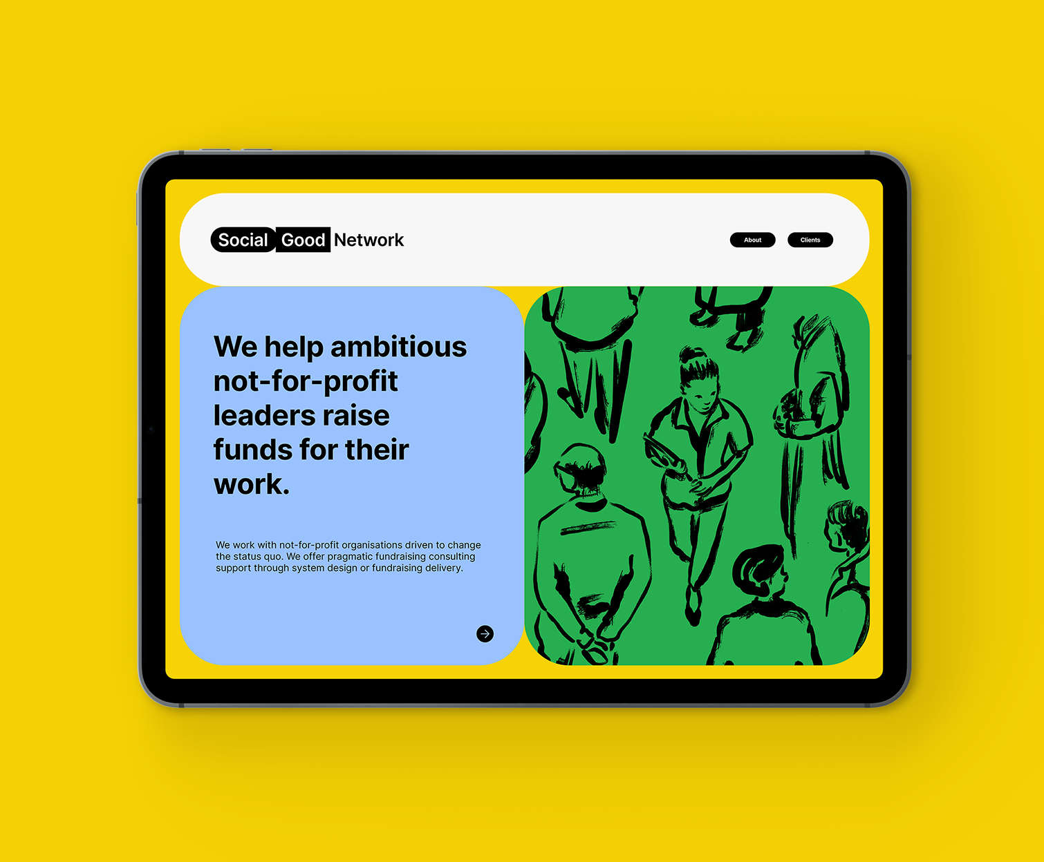
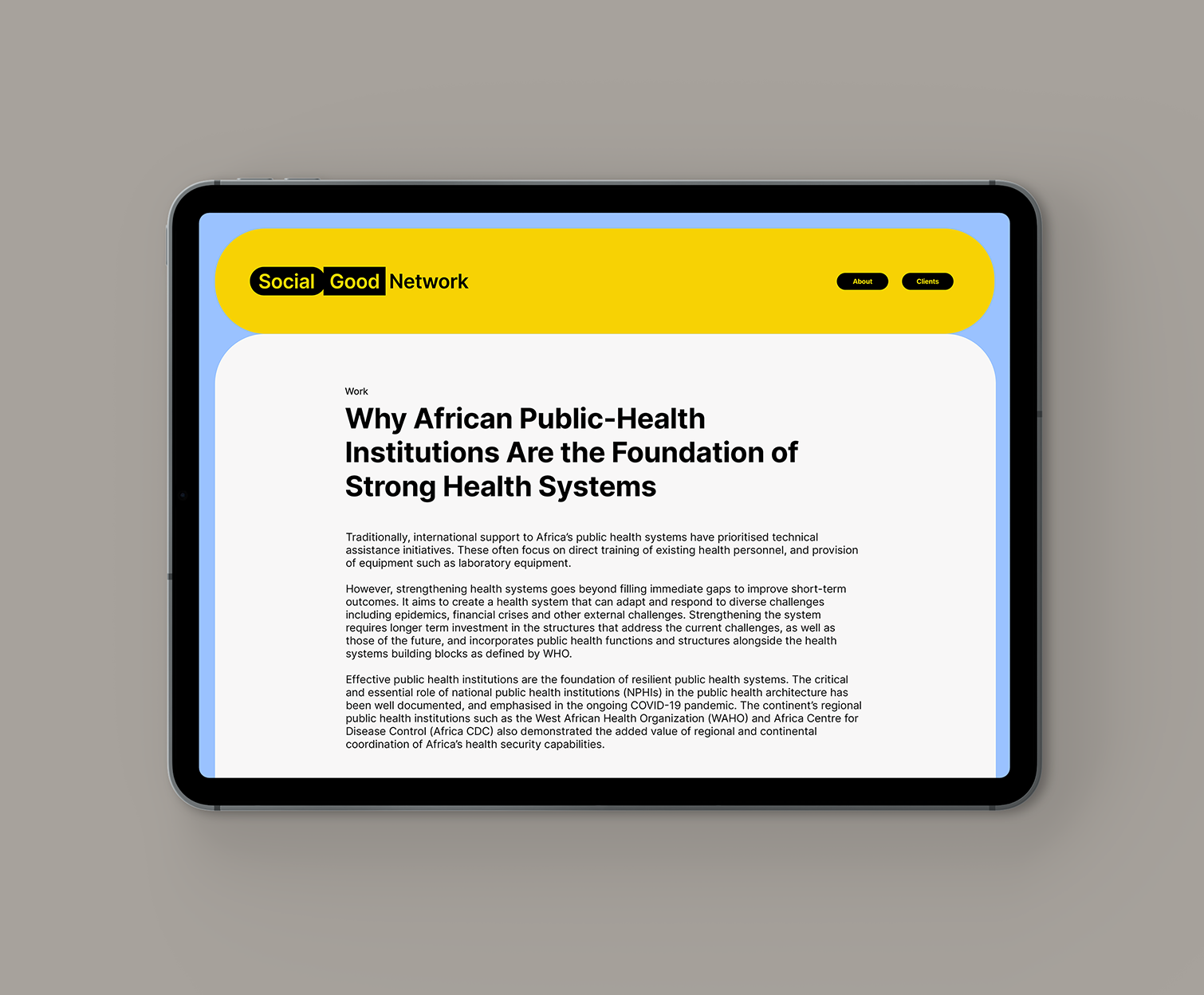
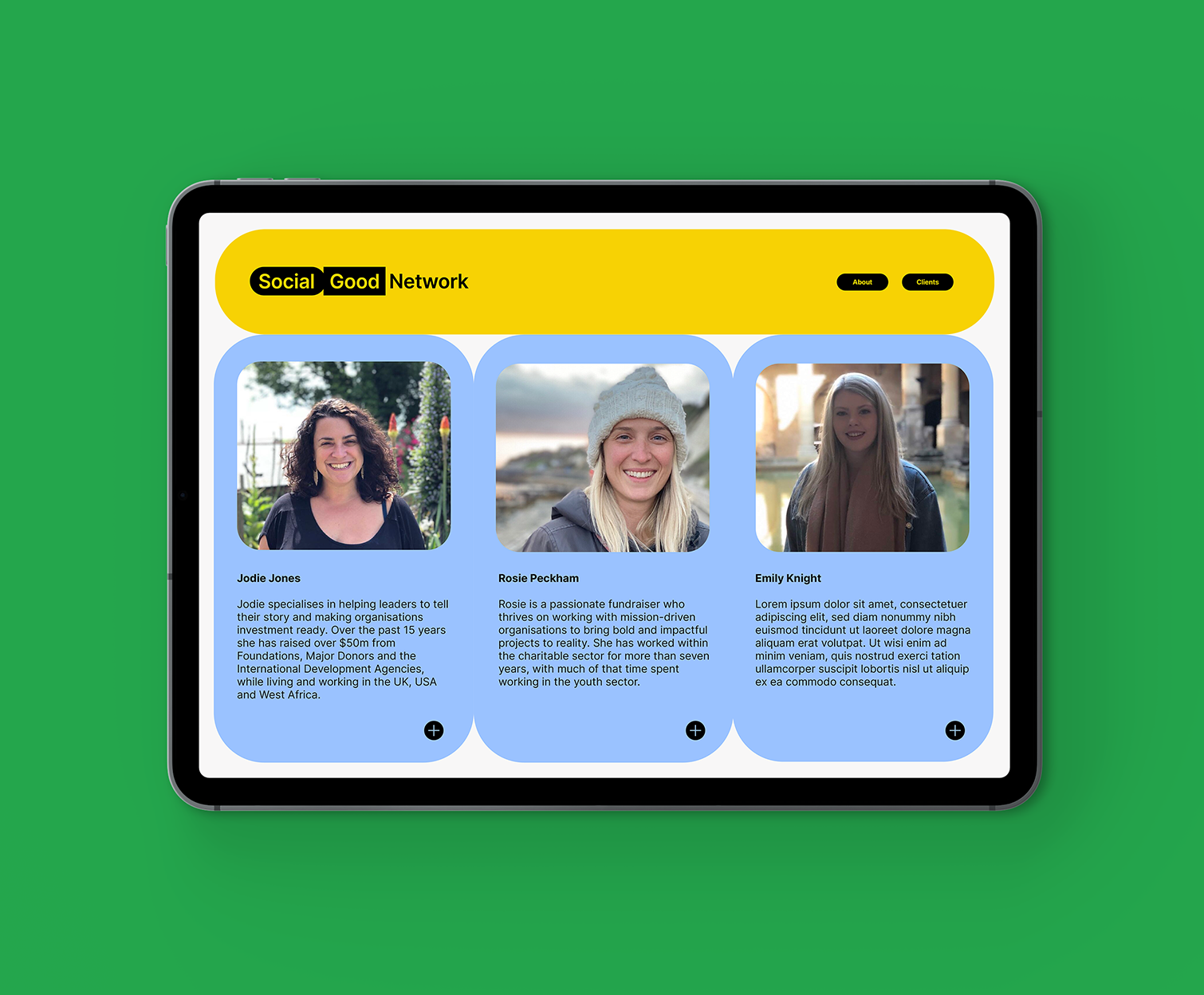
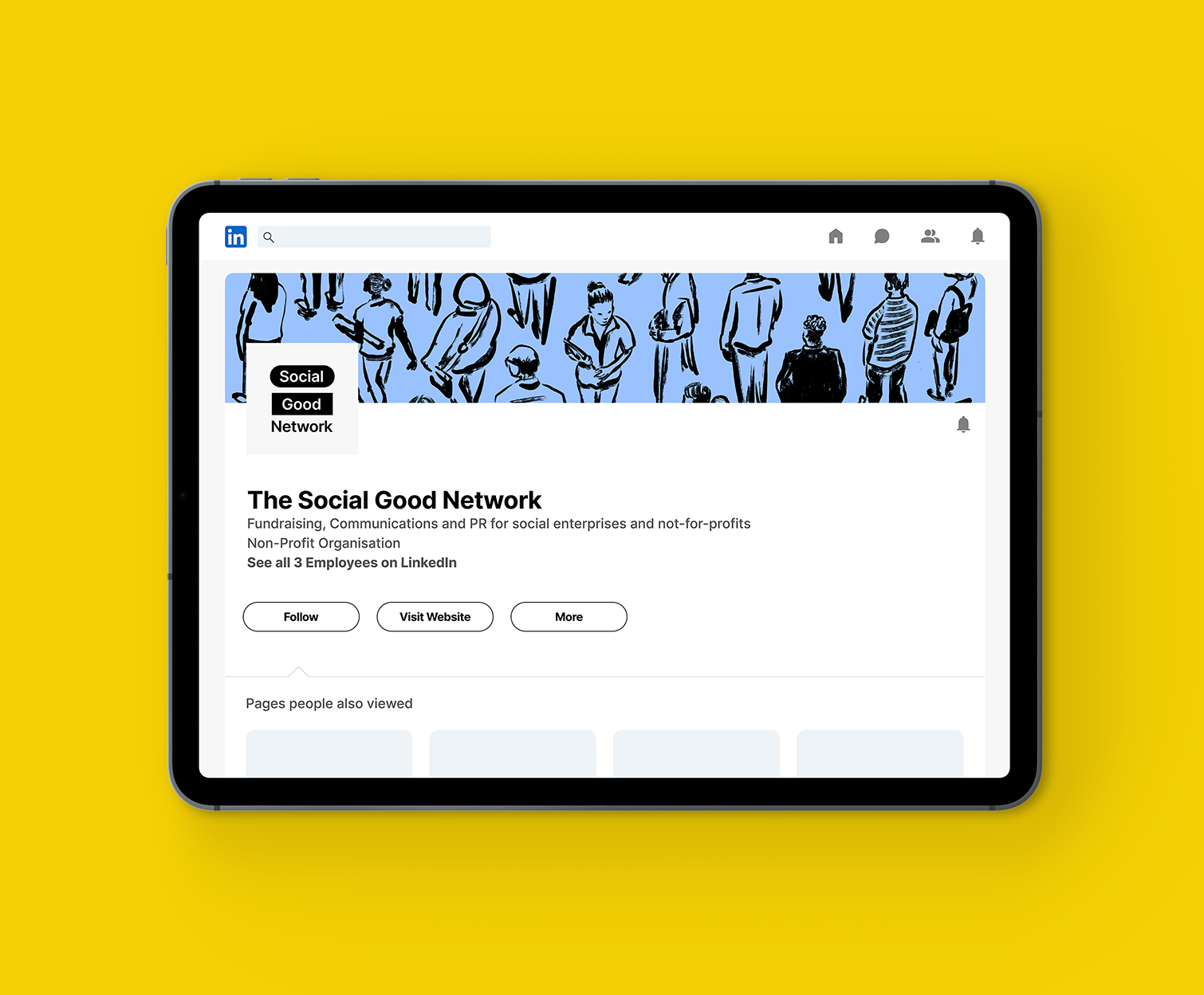
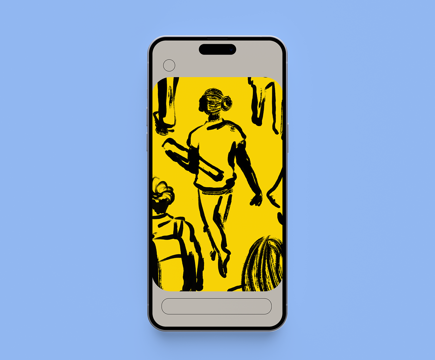
A VISUAL IDENTITY FOR THE SOCIAL GOOD NETWORK
The Social Good Network knows that small groups of people, working across borders and boundaries, can change the world. It’s why they helps not-for-profit leaders raise funds for their work by offering practical fundraising support to non-profits around the world.
I worked closely with the Social Good Network’s founder Jodie Jones to develop a new visual identity for the network. Creating a brand that would symbolise the energy, determination and goodwill that define all that they do.
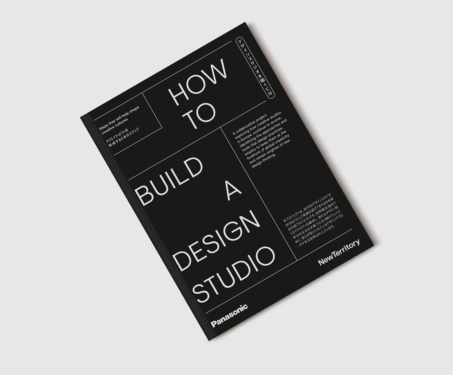
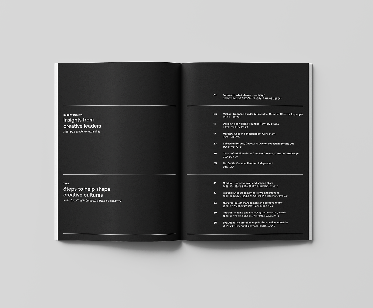
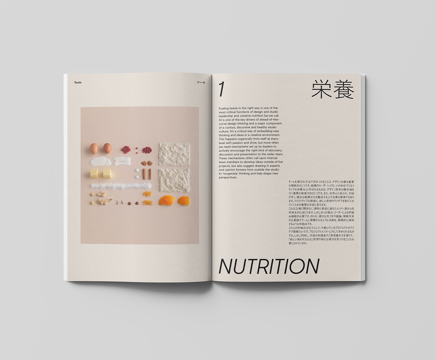
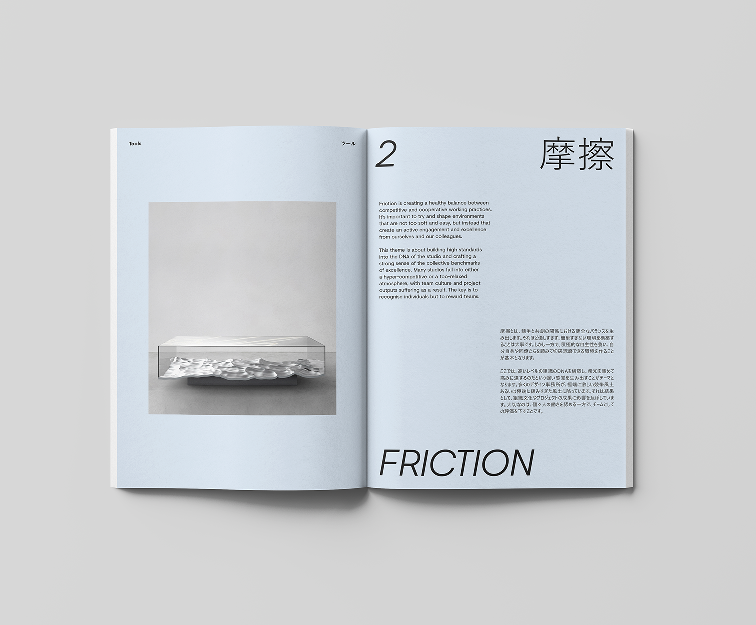
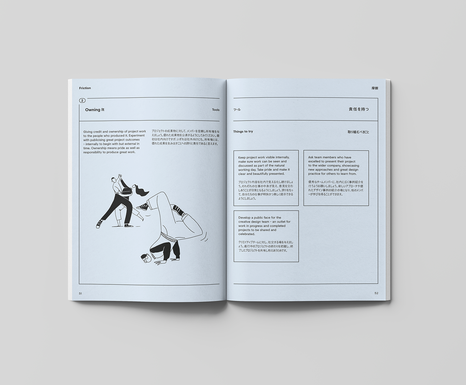
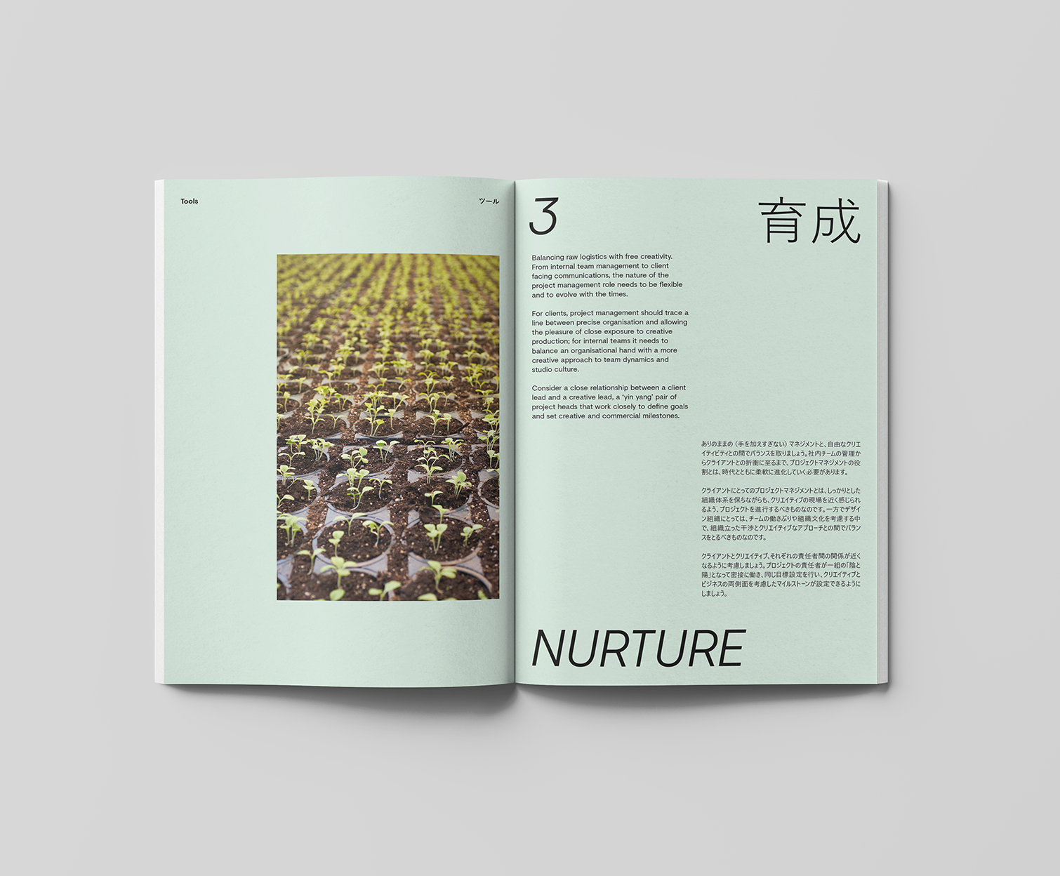
EDITORIAL AND BOOK DESIGN FOR NEWTERRITORY
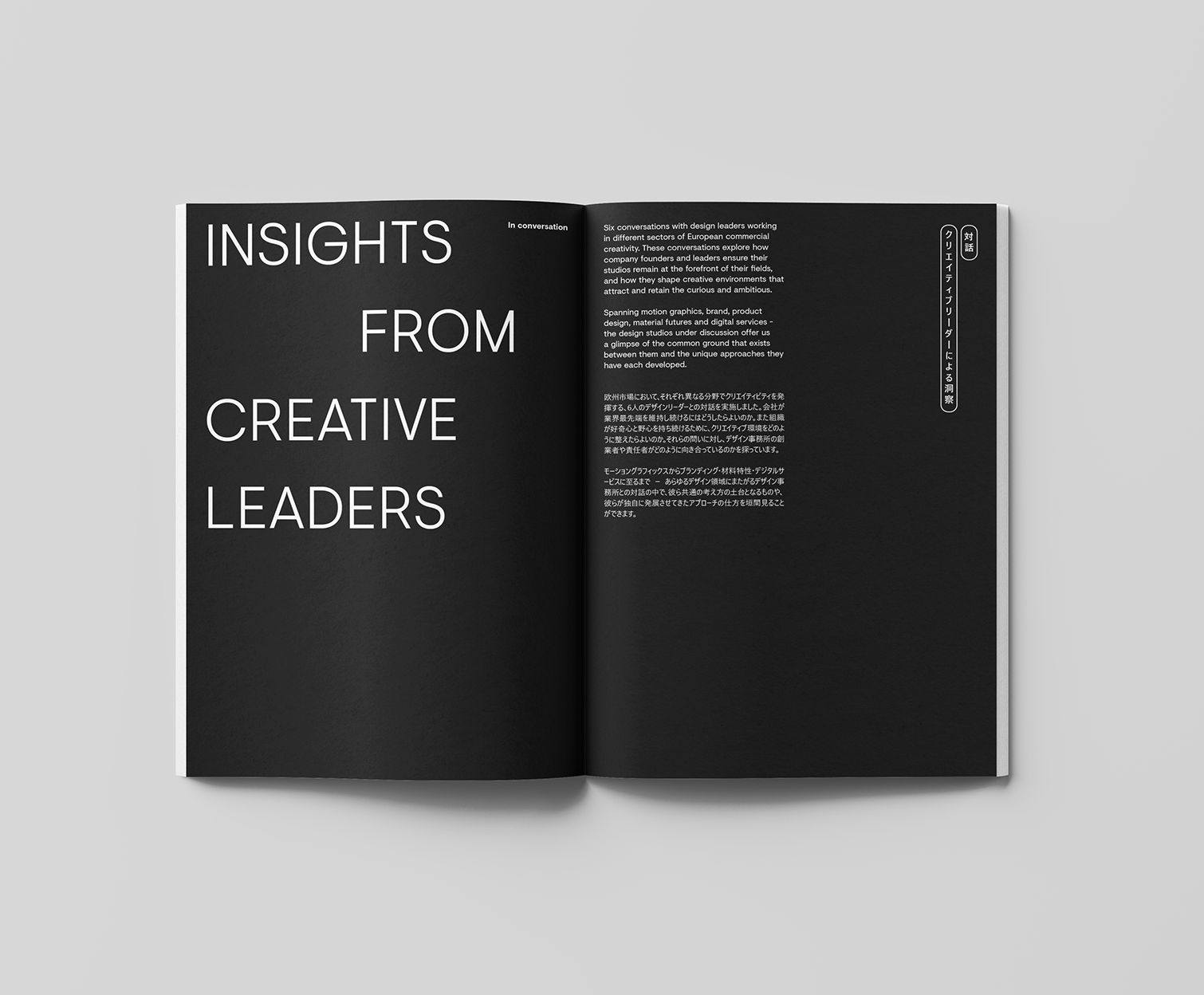
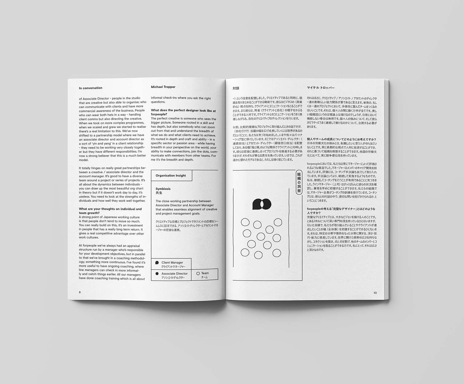
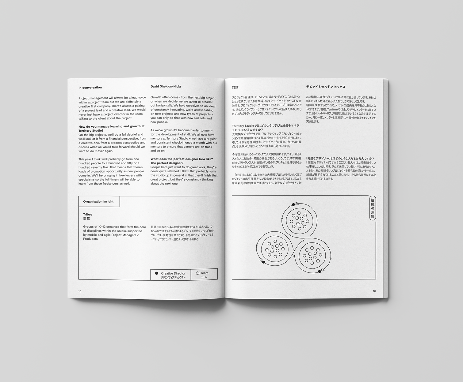
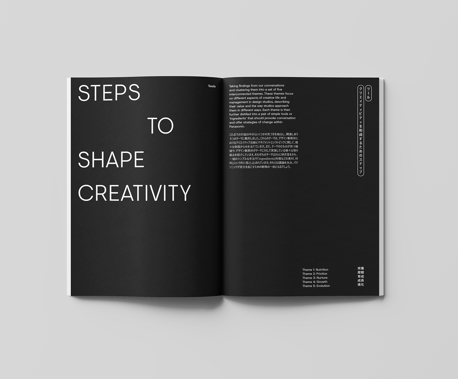
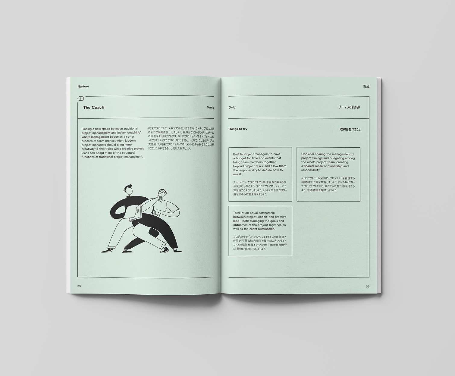
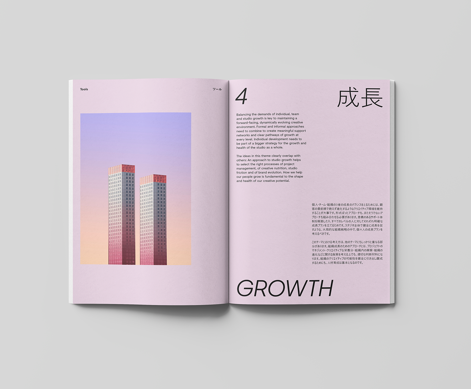
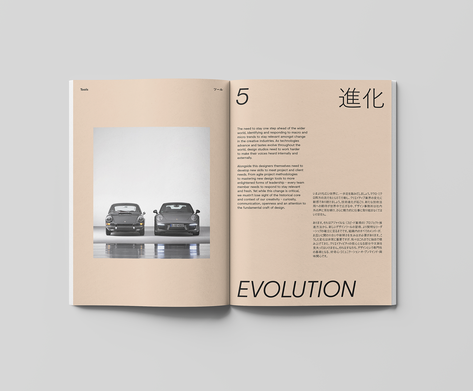
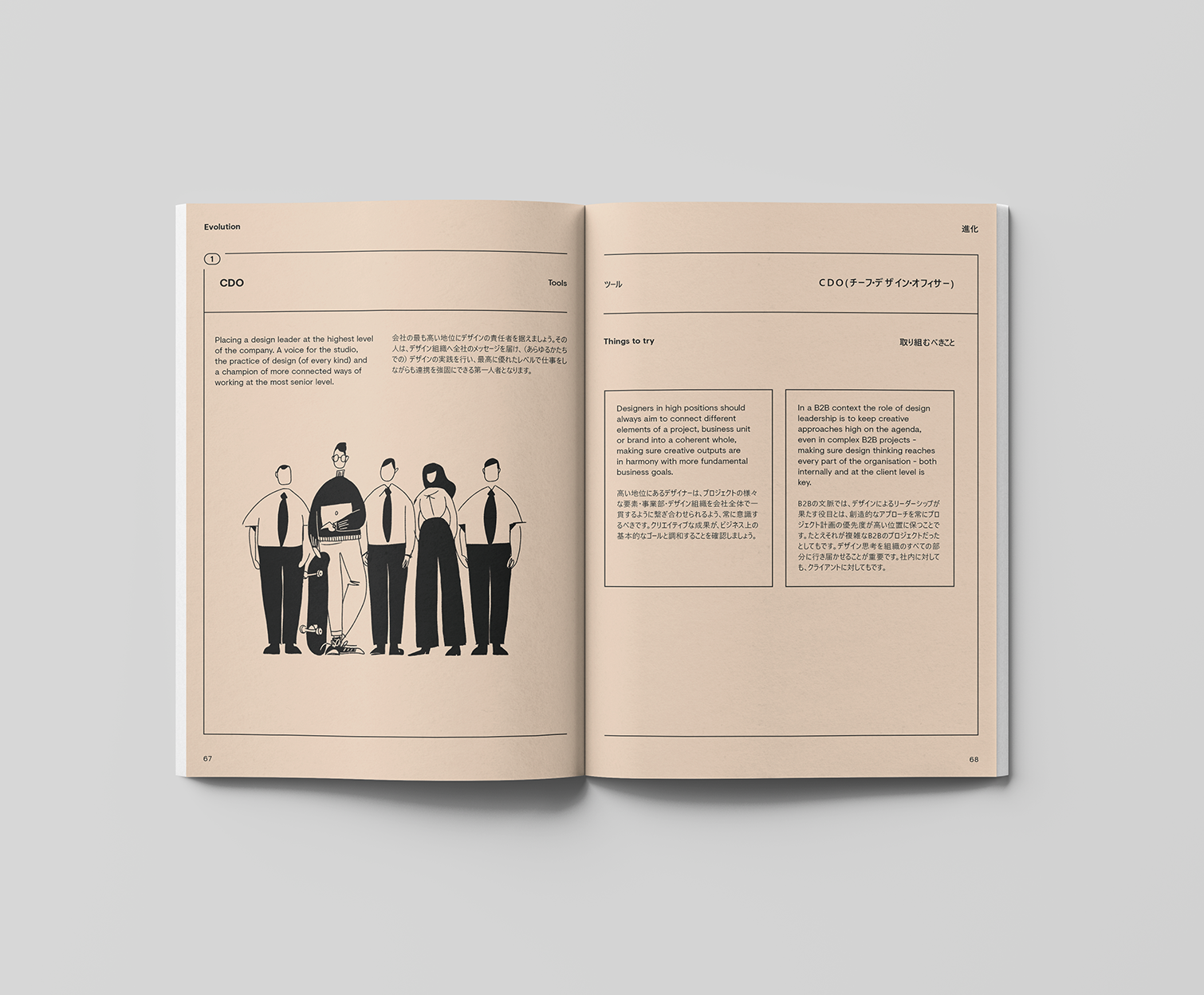
I worked closely with New Territory who did the research for this book. With the project, they wanted to create a book that would would have insights from creative leaders in the UK, along with practical tools and techniques for shaping a creative culture. The finished volume needed to feel modern and inspiring, present the findings clearly and use both english and Japanese.

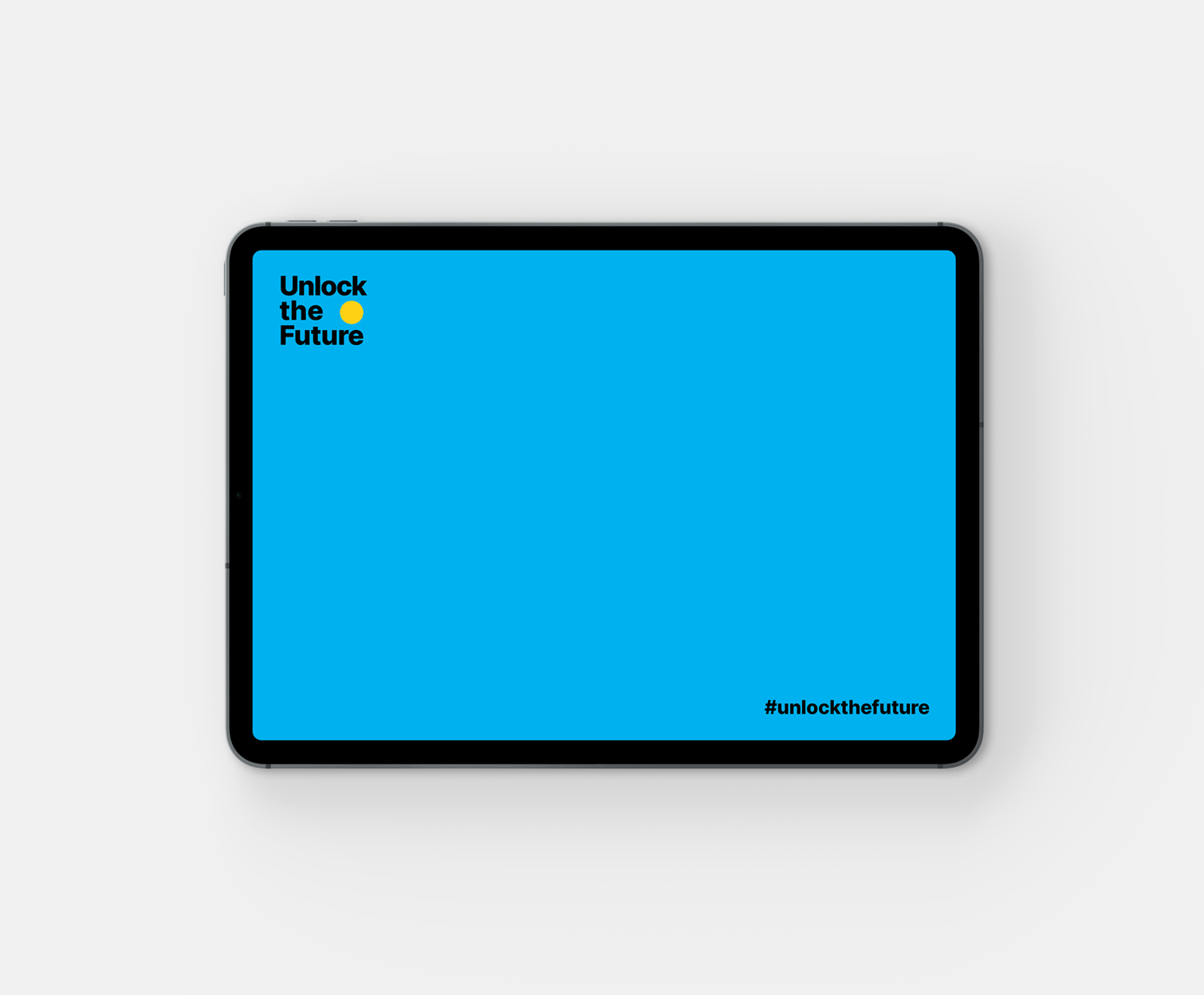
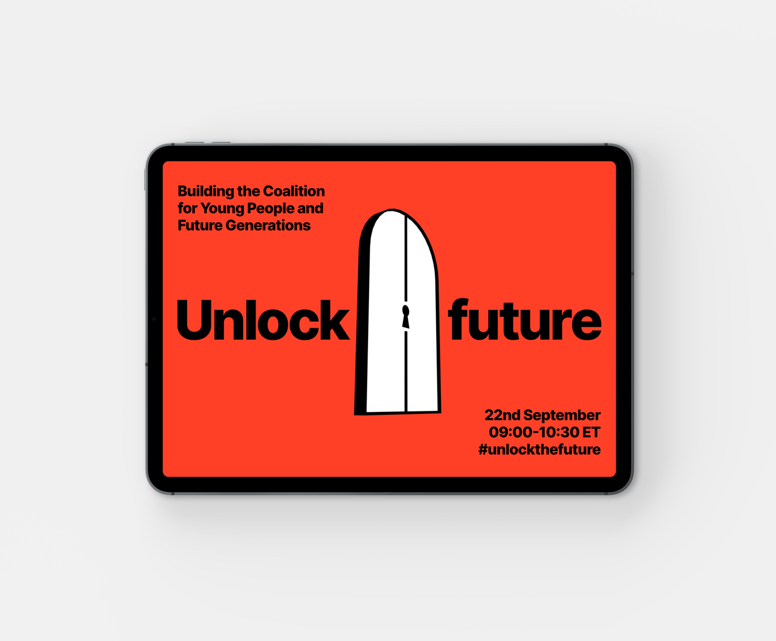
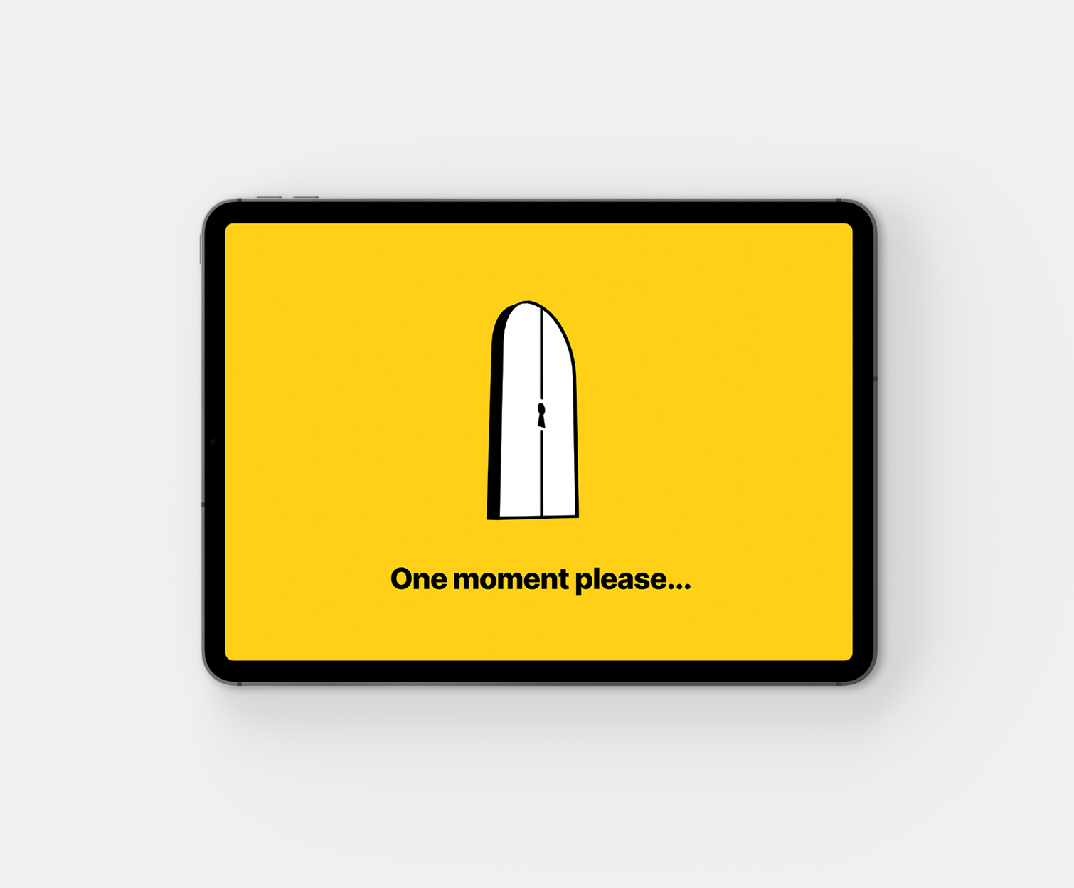
A CAMPAIGN VISUAL IDENTITY FOR THE UNITED NATIONS FOUNDATION
Working with the United Nations Foundation I created the branding for #UnlocktheFuture, a high-level virtual event which took place as global leaders gathered for the opening of the UN General Assembly, and marked the beginning of the coalition for young people and future generations.
This meeting was hosted by the world’s most far-reaching youth-led and youth-focused networks and movements. At its heart, it was about the voices of a new generation of leaders, activists, and thinkers, in dialogue with their peers from other generations.
BRAND DEVELOPMENT FOR THE TONY BLAIR INSTITUTE FOR GLOBAL CHANGE
I managed the brand strategy, architecture and development for the Tony Blair Institute for Global Change. The new brand needed to emphasise a sense of unity and collaboration as the Institute brought together two charities and two businesses, merging them into one not-for-profit. The process was extensive, on top of developing the architecture it included the managing of multiple agencies to deliver the vision, including commission the logo design, website design, name development, office design, and the design of marketing materials, stationery and publications.
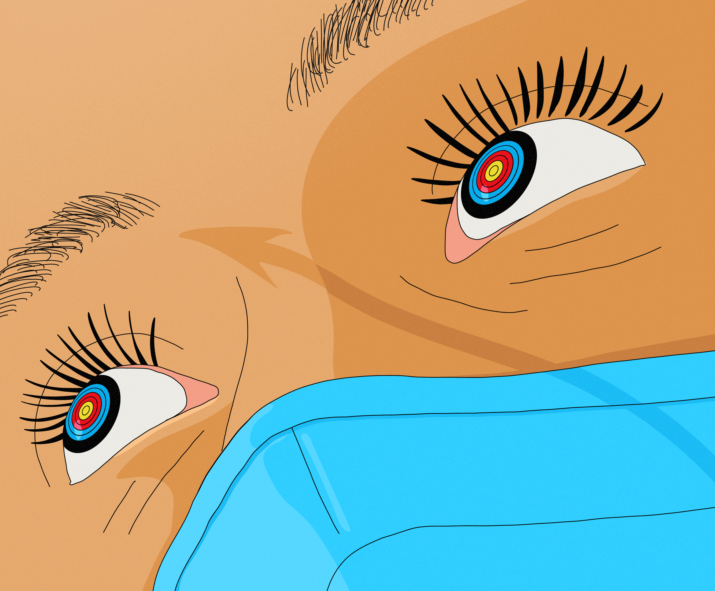
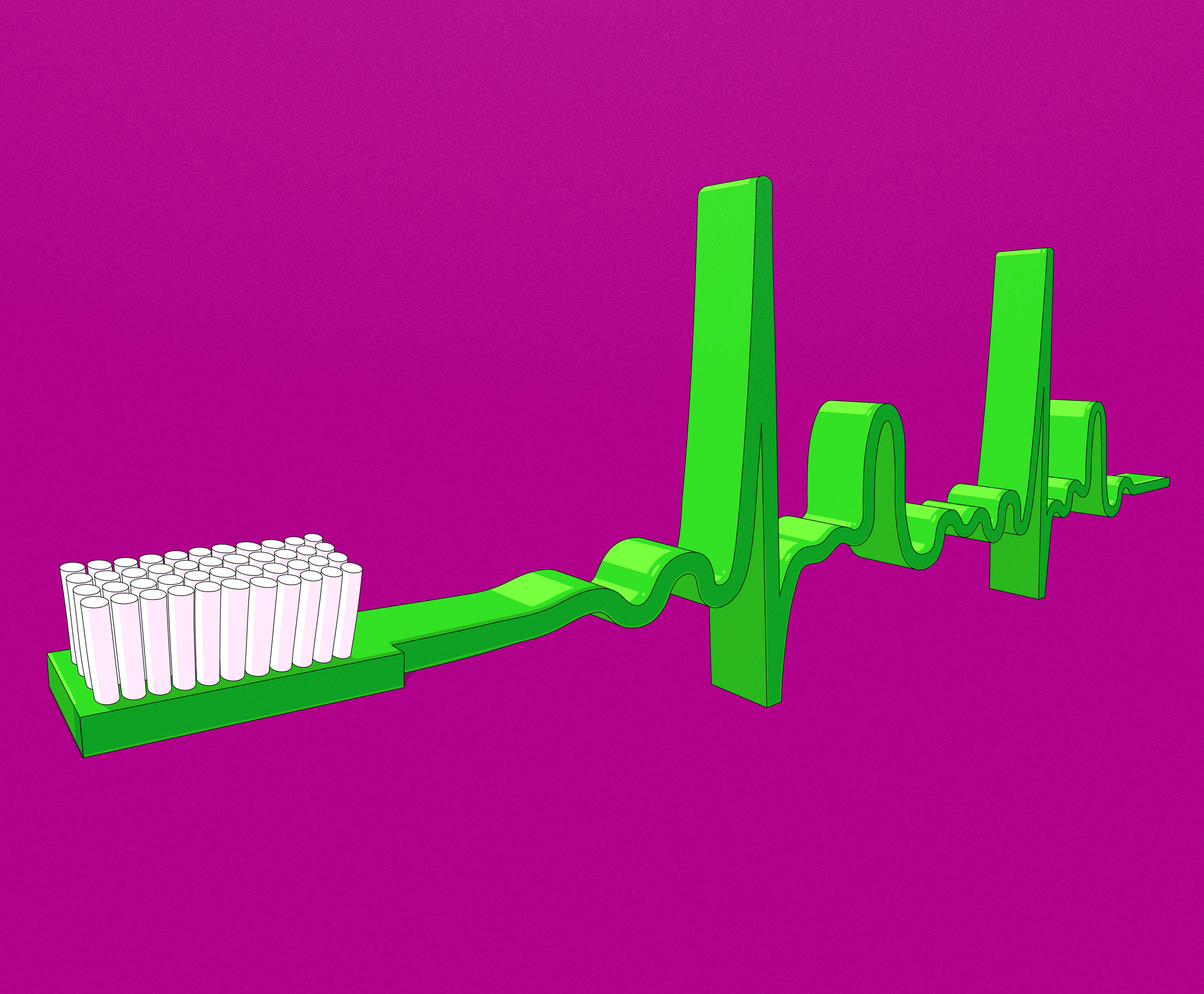
ILLUSTRATION FOR THE BRITISH DENTAL ASSOCIATION
I worked closely with the communications team at the BDA to develop a set of illustrations for a series on NHS targets and service sustainability. NHS dentistry is managed through a system of activity targets, where targets are used to calculate how much dentists are paid. Major reforms are needed across the UK to make this service sustainable for dental practices and their patients.
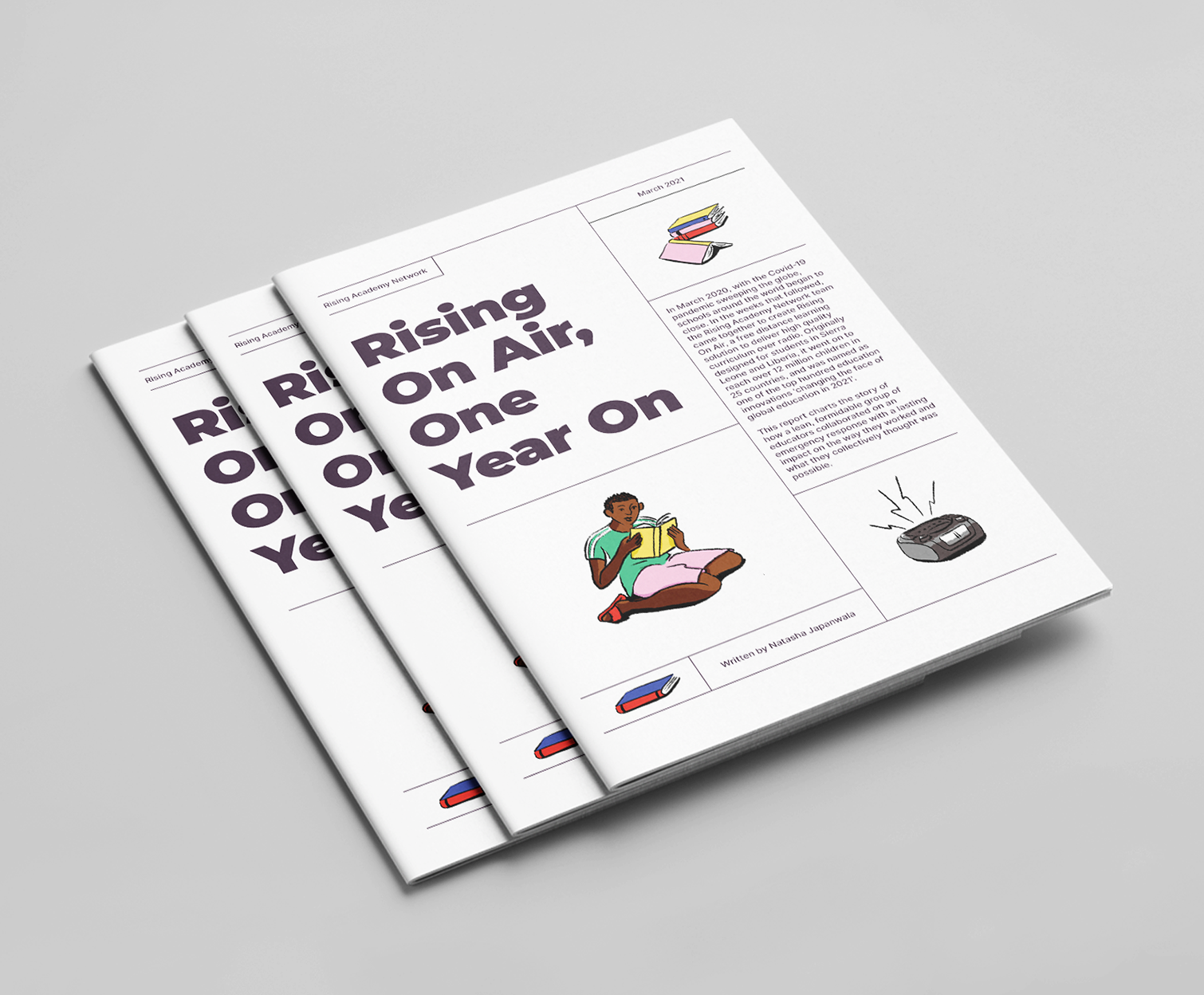
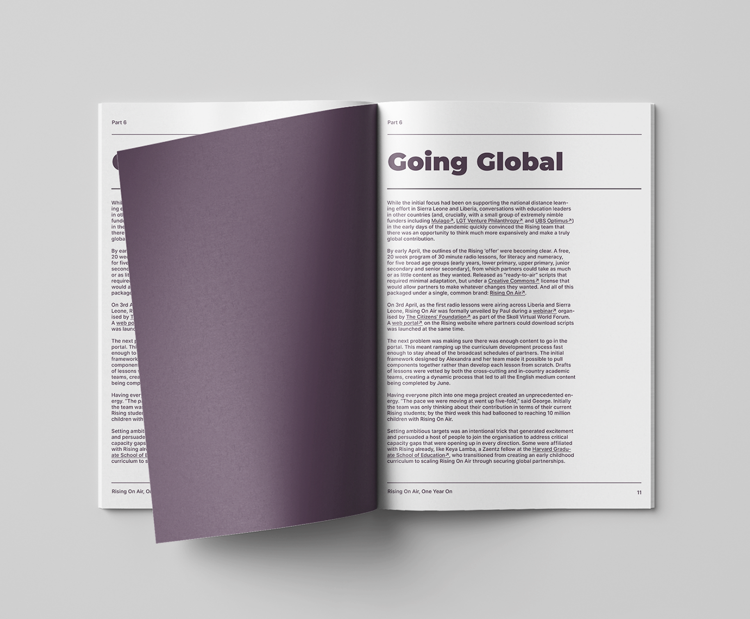
EDITORIAL DESIGN FOR THE RISING ACADEMY NETWORK
The report charts the story of how the Rising Academy team came together, as Covid-19 swept the globe, to create Rising On Air, a free distance learning solution to deliver high quality curriculum over radio.
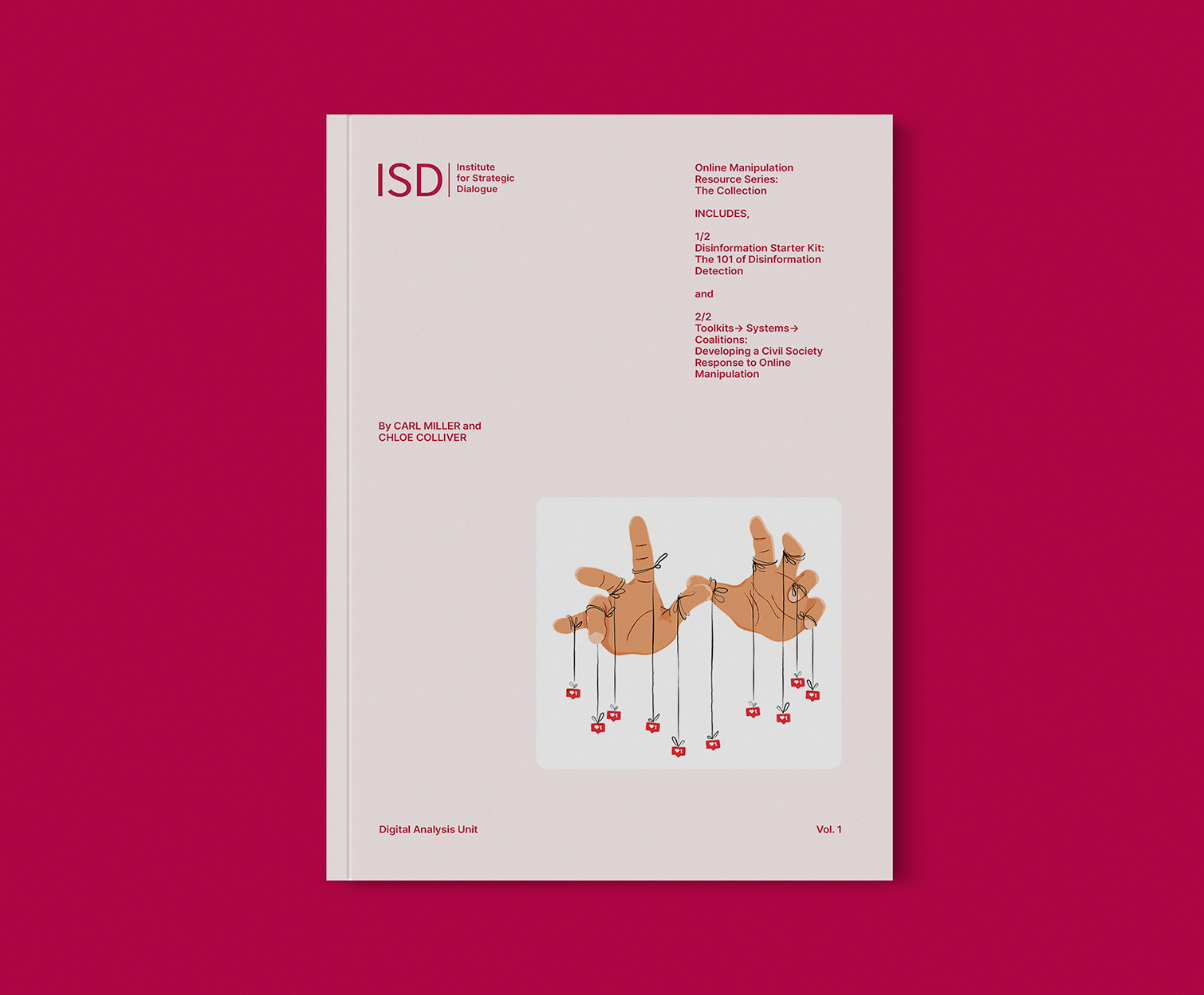
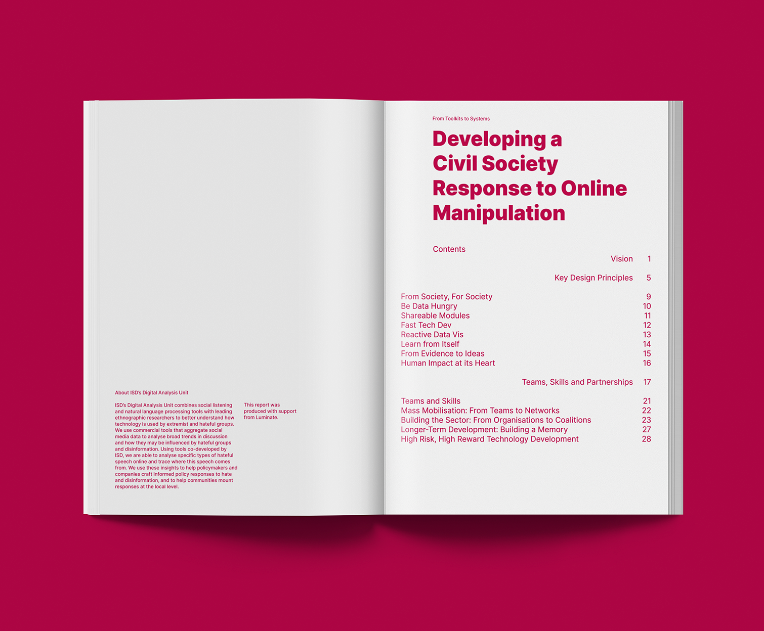
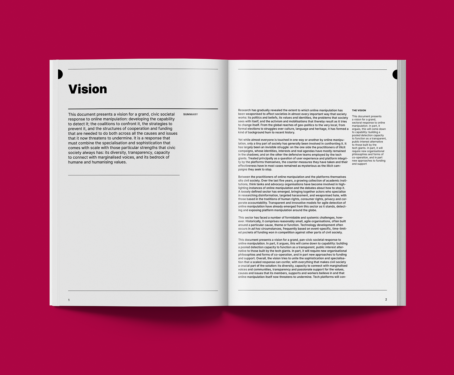
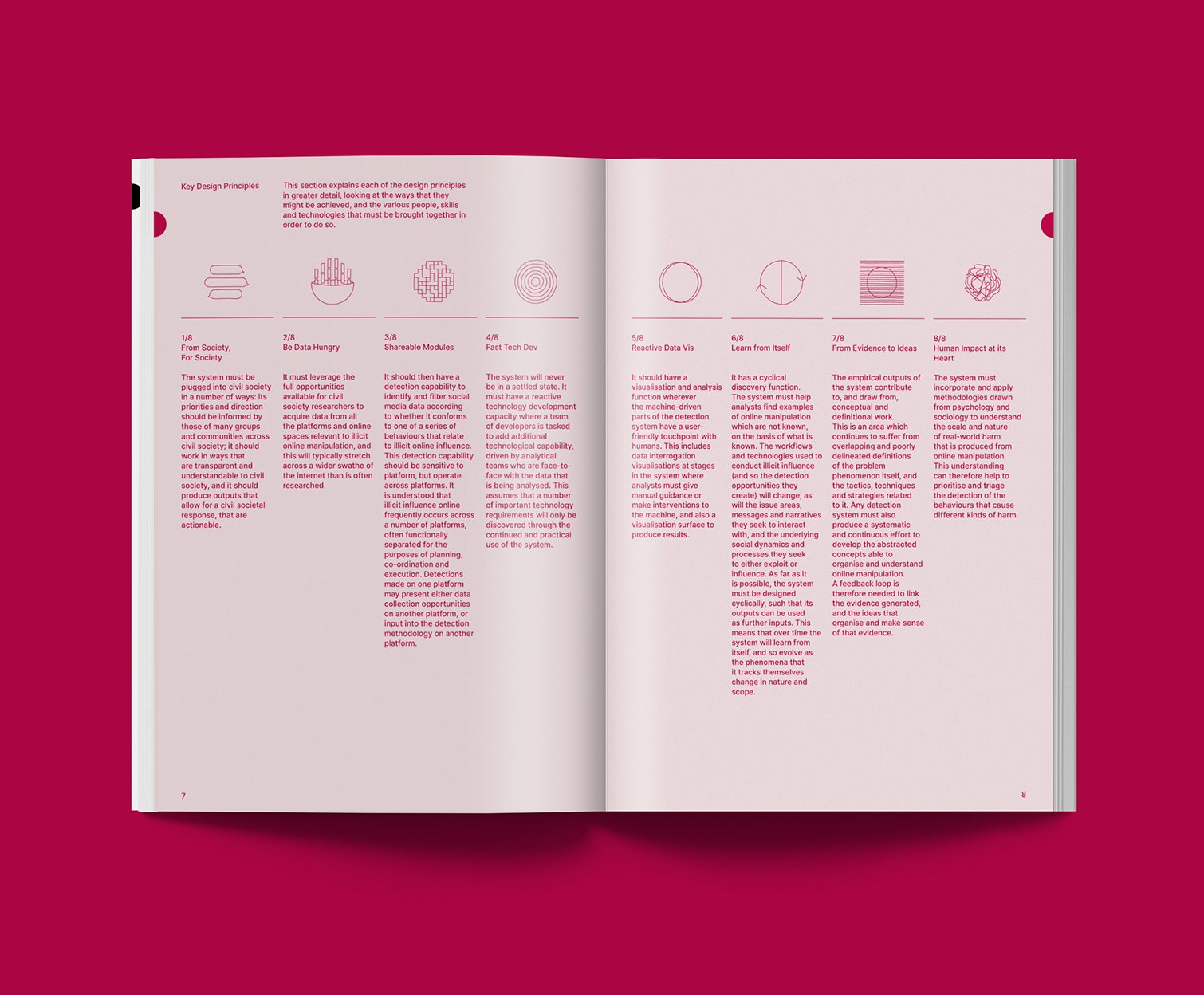
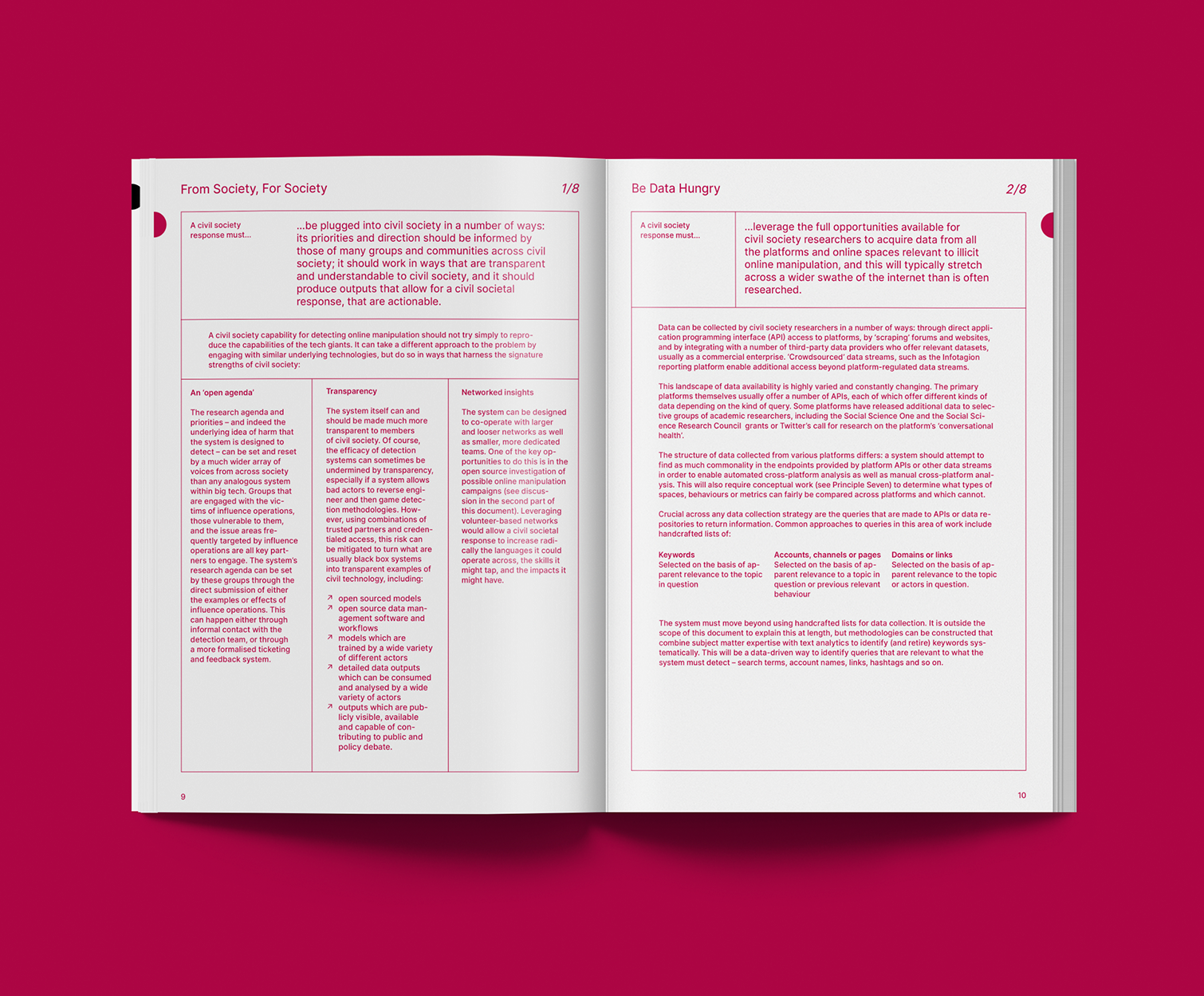
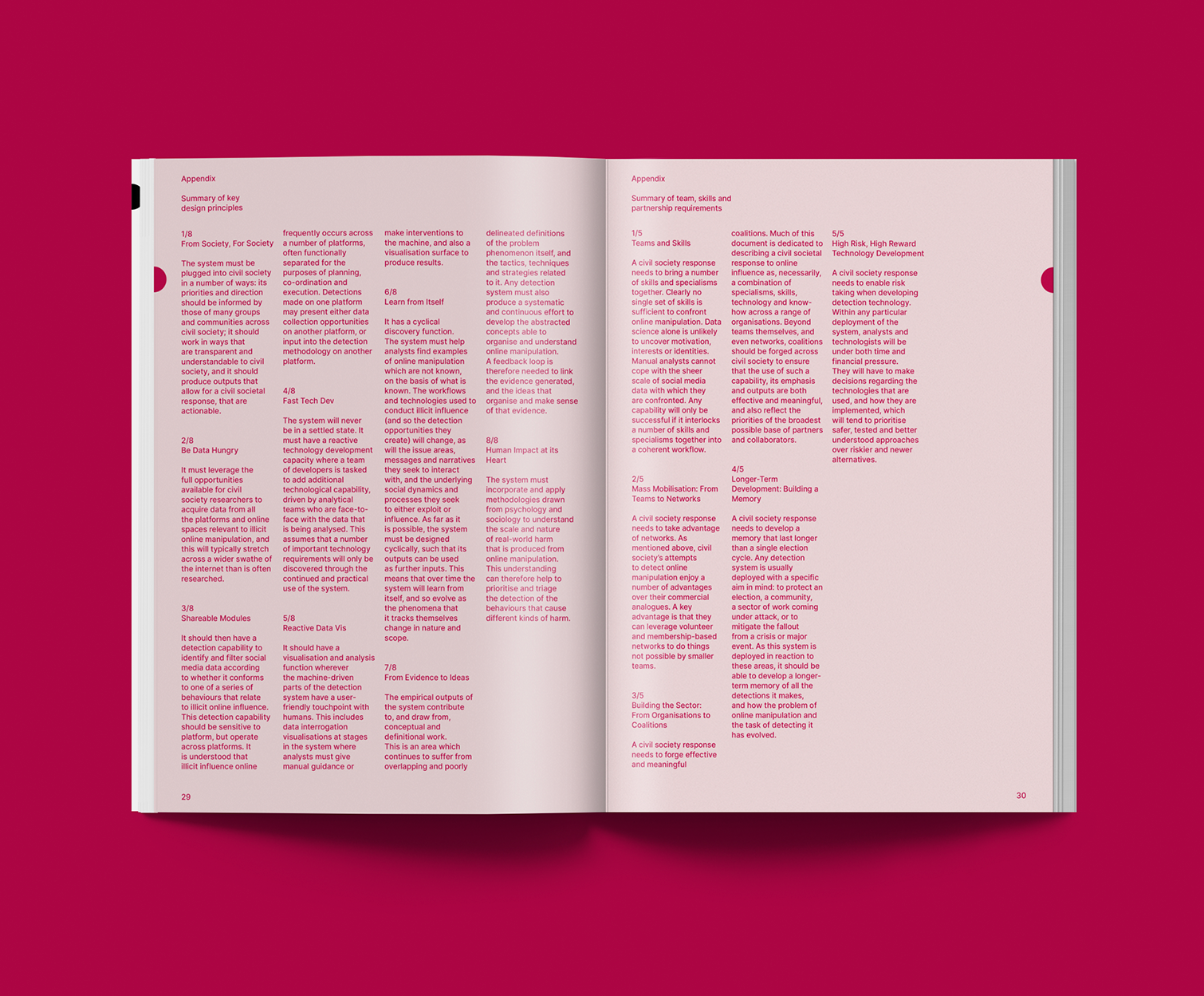
EDITORIAL DESIGN FOR THE INSTITUTE FOR STRATEGIC DIALOGUE
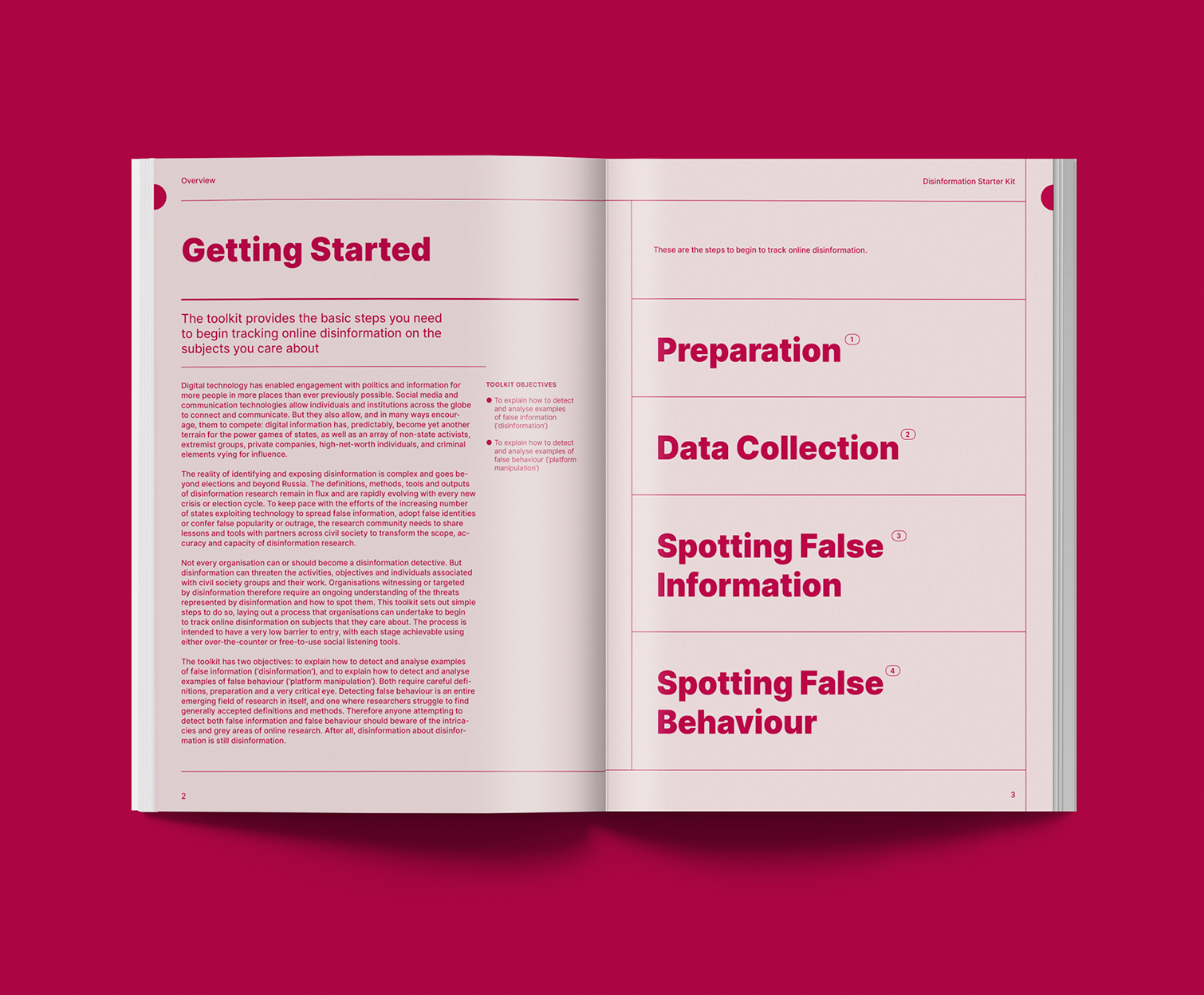
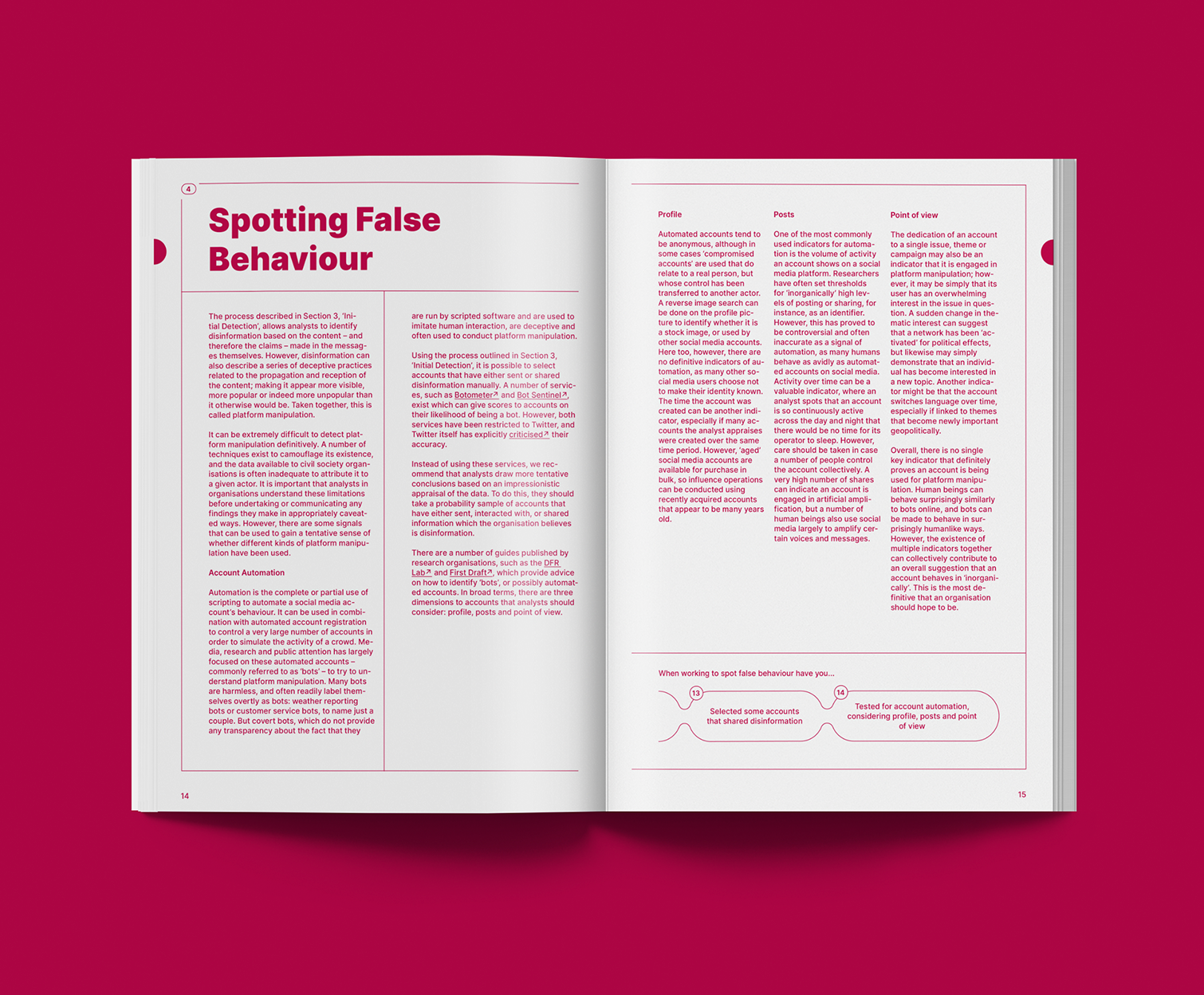
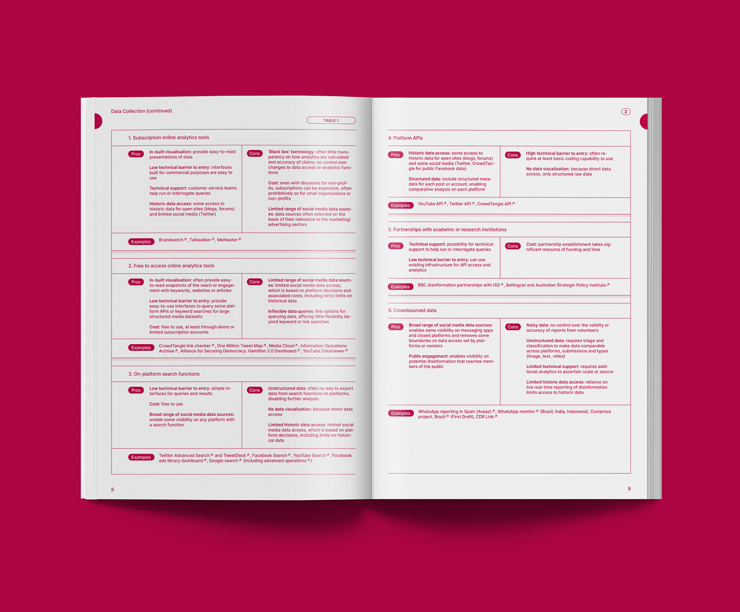
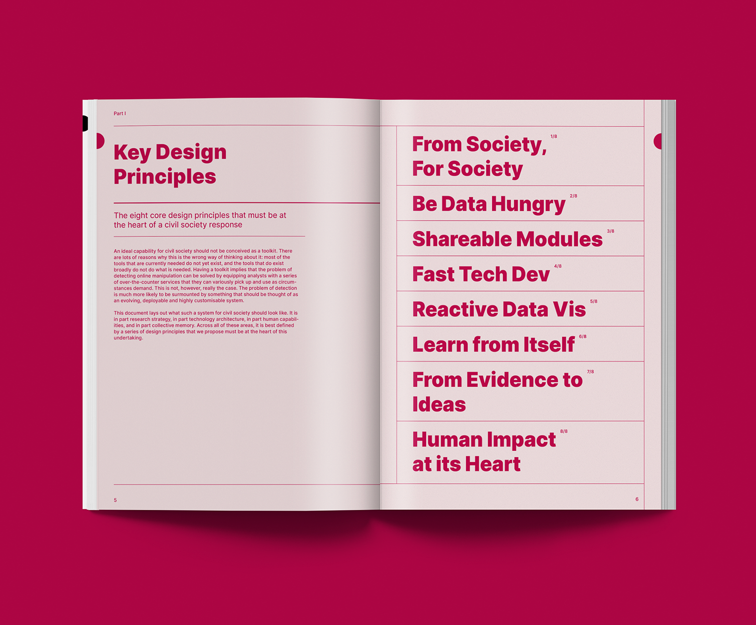
This publication by the Institute for Strategic Dialogue presents a vision for a pan-civil societal response to online manipulation. Editorially, the publication needed to be accessible, straightforward and visually appealing. So, the layout works more like a recipe book than a traditional publication, making the step-by-step instructions as clear as possible. The art direction uses colour and white space to create a simple but serious feel, making it easy for the user to navigate quite dense copy. A distinctive cover illustration adds colour and dynamism.
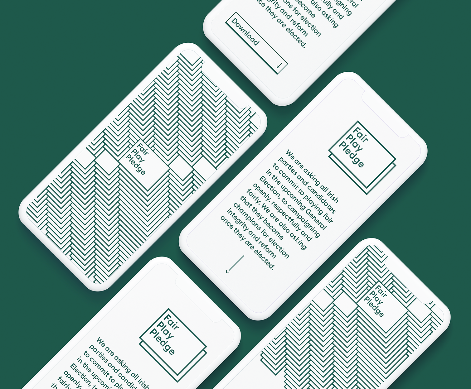

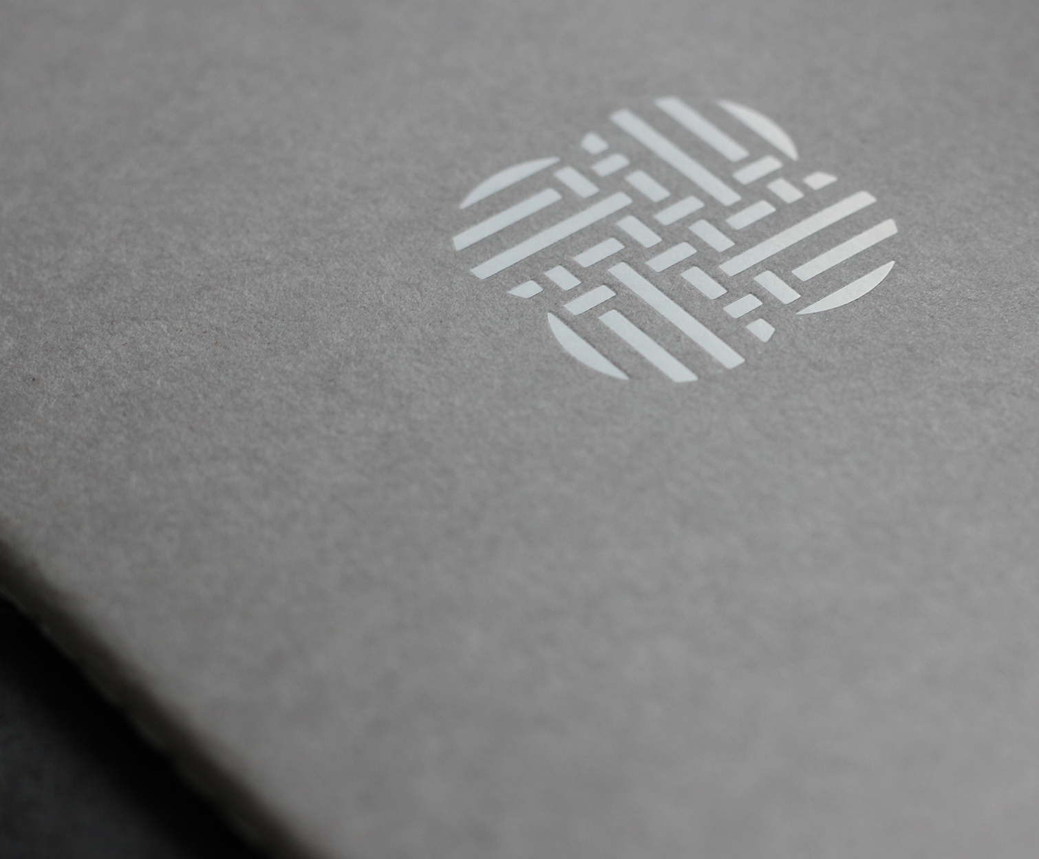
A CAMPAIGN VISUAL IDENTITY FOR THE FAIR PLAY PLEDGE
Working with the team of civic activists I created a new identity for the Fair Play Pledge. The Fair Play Pledge asked all Irish parties and candidates to commit to playing fair online in the recent election. To commit to campaigning openly, respectfully and fairly. And to become champions for election integrity and reform once they are elected. With the logo and the corresponding pattern I wanted to make reference to the annoying (and dangerous) pop-up windows we’ve gotten use to, though not the kind of online harm the pledge was concerned with, they are one of the easily associated instances of online mischief.
STUDIO APM is the work of Brent Gorsky
Studio Apm Limited is a company registered in England and Wales with number 11518095 whose registered office is 27 Mortimer St, London W1T 3BL